Movie posters are a powerful marketing tool that tells people about the story and attracts the target customer with visual elements. While most people think movie posters are simply created by putting the text on top of an image, there is actually a lot of work that goes into poster design. Movie poster designers have to take into consideration the style, typography and other visual elements to make sure the presentation is attractive enough to engage people and even get people off the couch. Here are five main areas that matter when designing a movie poster.
(1) Grab Attention with Good Combination of Visual Elements
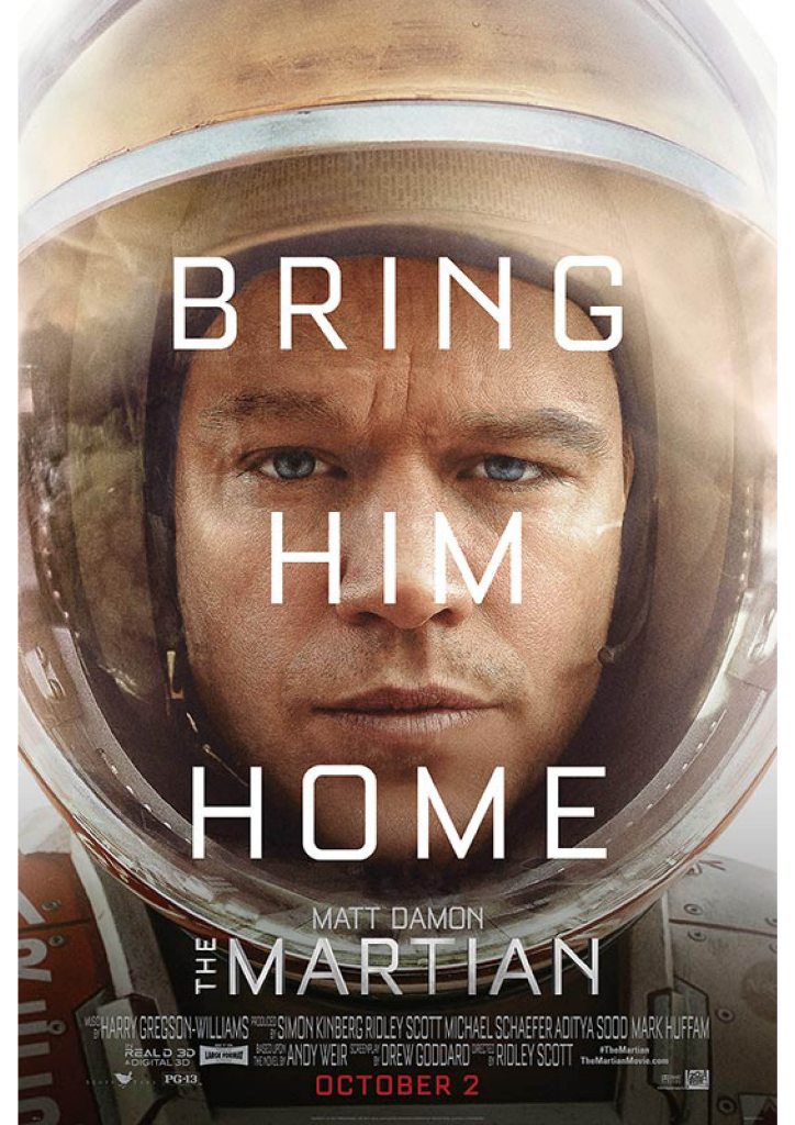
A good movie poster is a selling tool that lures people into watching the movie and leave them wanting more. A poster can be aesthetically beautiful like a piece of art, but if no one gets it, it is not of much use. Therefore, it should grab the viewer’s attention by leveraging a variety of visual elements, including imagery, shapes, text and colours, while reflecting the nature of the movie at the same time. One of the common approaches these days is to use the picture of the leading actor or actress to capture potential viewers’ attention. The movie The Martian is a classic example. As simple as the design seems, the close shot of Matt Damon coupled with persuasive tag line ‘Bring Him Home’ create a mind-blowing picture, making people not to look away.
(2) A Consistent Style
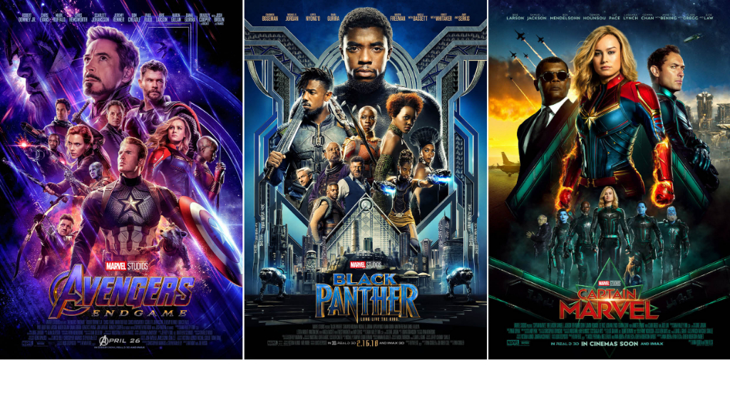
It is important to cater the style of the movie poster to the movie itself or it will appear confusing to the viewers. Whether it is a comedy, an art film or a film based on comics, there should be a consistent use of graphics within the film. The popular superhero films from Marvel Studio are an excellent example. Their posters usually use stylized imagery as the film itself and the iconic comic typefaces to engage the viewers and reflect the characteristics of the film. The consistency makes the blockbusters even more appealing to watch.
(3) Typography
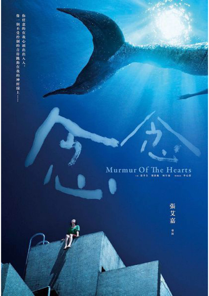
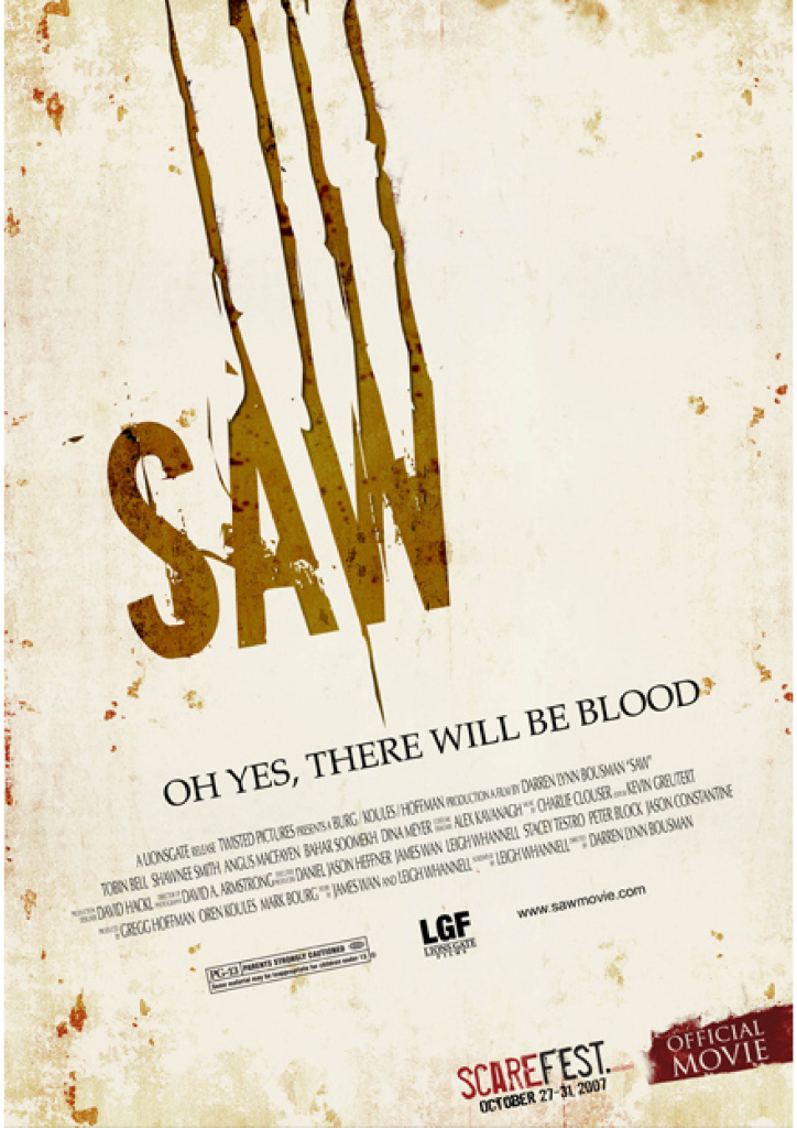
Typography is a main visual element in successful movie poster design. Through picking a suitable typeface, size, weight, colour, position and effect, typography can drive positive results as imagery do. Other than putting the text front and centre in movie poster designs, while some prefer using decorative typeface to visualise the text and reflect the unique characteristic of the movie like the one in Saw and MurMur of the Hearts, both enhancing the impact of presentation and the results the text brings about.
(4) Create Hype
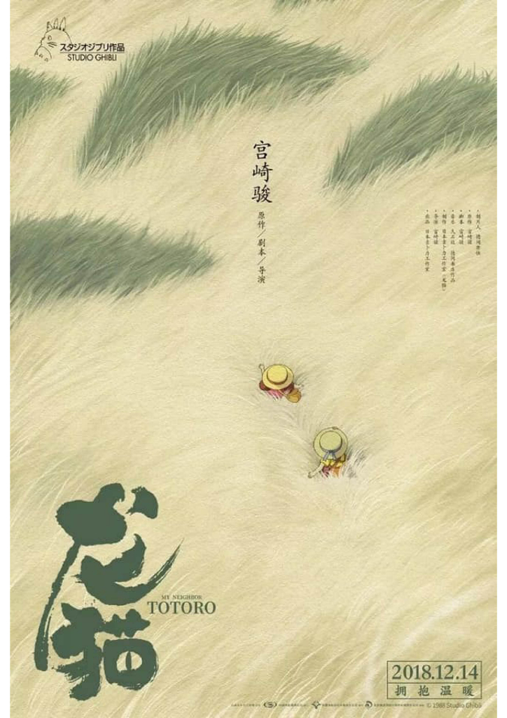
There are different things that we can do to get people talk about the movie before the release. One of them is to create a buzz-worthy movie poster that causes a hype on social media. Simply drop a hint in the poster or put the viewers in surprise through the imagery which gives an unexpected turn will already do. For example, the new poster of My Neighbour Totoro for screening in China had successfully sparked a heated discussion over every social media platform after it was dropped. Here’s the magic of the poster that mesmerises every one — At first glance, people thought the background was grass, but it turned out to be the hair of Totoro. A smart move, isn’t it?
5) Looks Good in other Formats
Nowadays, movie posters are not only put up on billboards, but also on our laptops, mobile phones and tablets. That is why it is important to keep the movie title, imagery, selling points visible and clear when the poster is shrunk to a small size. Creating several versions of movie posters to cater for different use is possible for sure, but it is going to make the movie more recognisable if the same poster is use in all forms of advertising platforms.
———————–
Movie posters or other types of posters are a powerful marketing tool for increasing your market penetration and communicating your products or services. Feel free to contact us if you need a little help with designing an engaging poster for your business.
Tel: +852 3460 5052
E-mail: info@ccplusmedia.com