No matter it’s a full services or budget airlines, you can always find an inflight magazine, a duty-free catalogue and a safety card in the seat back pockets. Most passengers would pick up the inflight magazine to kill time or the duty-free catalogue for some shopping fun. But how about the safety card? We know that it is essential to read but yet few of us do so even though it tells us survival instruction.
According to Aviation Security Regulation, there is standard instruction applied to safety card – Where’s the life vest? How does the oxygen mask work? Where’s the closest emergency exit? How does the cabin escape open? – Right, the content is boring, but the graphic design can be diversified and fun. On the basis of the brand image of each airline, the design aesthetics of each safety card is also different.
Most safety card’s design are focused on images rather than text, and usually with rich colors and fun illustration to catch passengers’ eyes. In the early stage, the design of safety card was presented with photos or hand-drawing. Nowadays while computer graphics are widely used, more options are provided for design layouts, such as Info Graphic, Doodle Art, Vector Graphic and 3D Figure Rendering that makes information more clear, simple and stylish. Some would focus on reading fun with amusing illustrations to keep your longer attention.
1960s-1990s: Photo or hand-drawing safety cards were mostly used in early years, simple layout with brief captions and plain illustration.
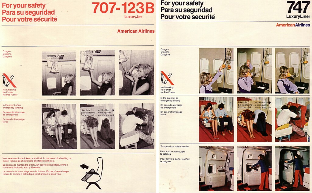
American Airlines 707-123B (1960s) / 747 (1970s)
Photo: black & white or color
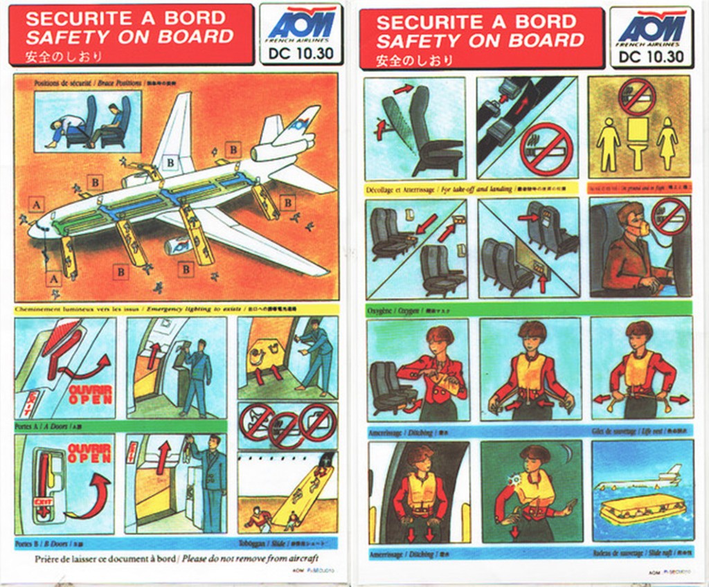
AOM French Airlines Douglas DC-10-30 (1990s)
Illustration: Watercolor Painting (Doodle Art)
In the late 1990s: Computer graphics became widely used, provided more diversified layout design.
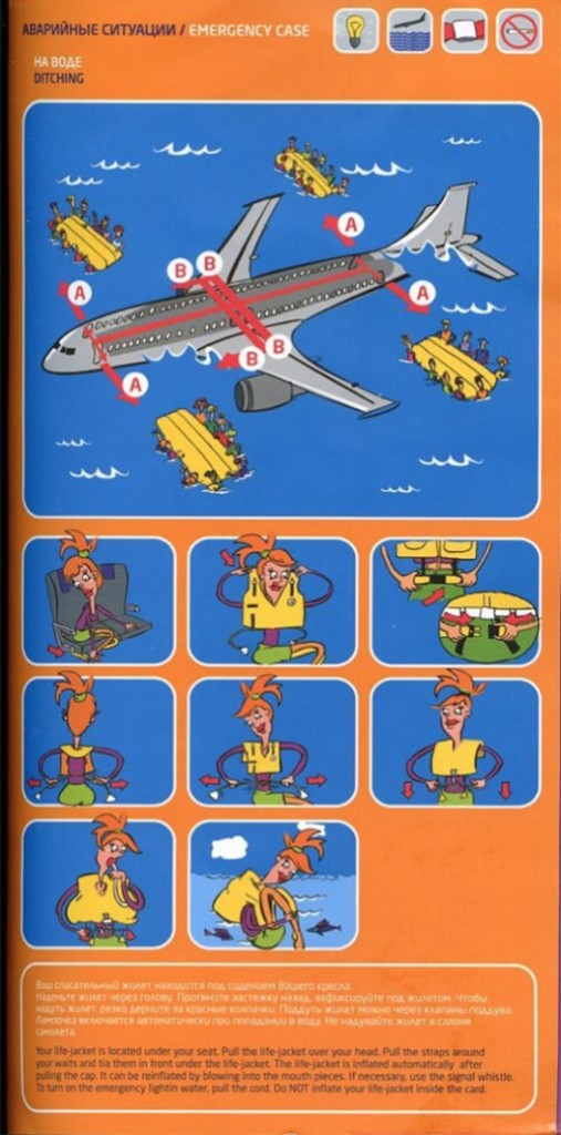
S7 Airlines (1990s)
Illustration: Cartoonish (Doodle Art)
The Simpsons was launched in 1989 and swept the world. Did the safety card design of S7 Airlines affected by it?
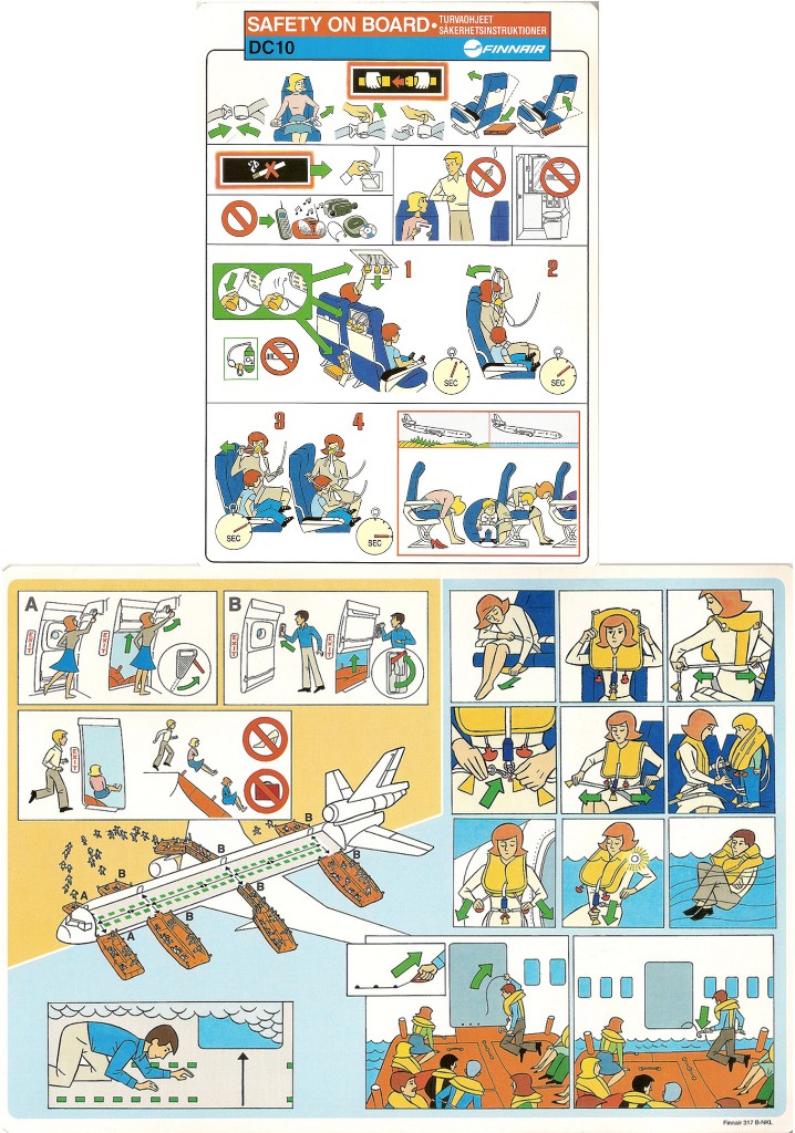
Finnair DC10 (1990s)
Illustration: Cartoonish (Doodle Art)
The safety card of Finnair only was presented with primary colors and simple drawing, without any description.
2000s: Stepping into the 21st century, Info Graphic and Doodle Art became the trend, and Vector Graphic becomes popular since 2008.
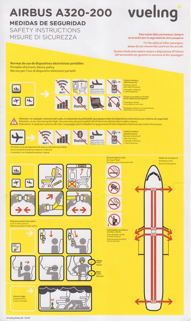
Vueling Airlines A320-200 (2000s)
Illustration: Info Graphic
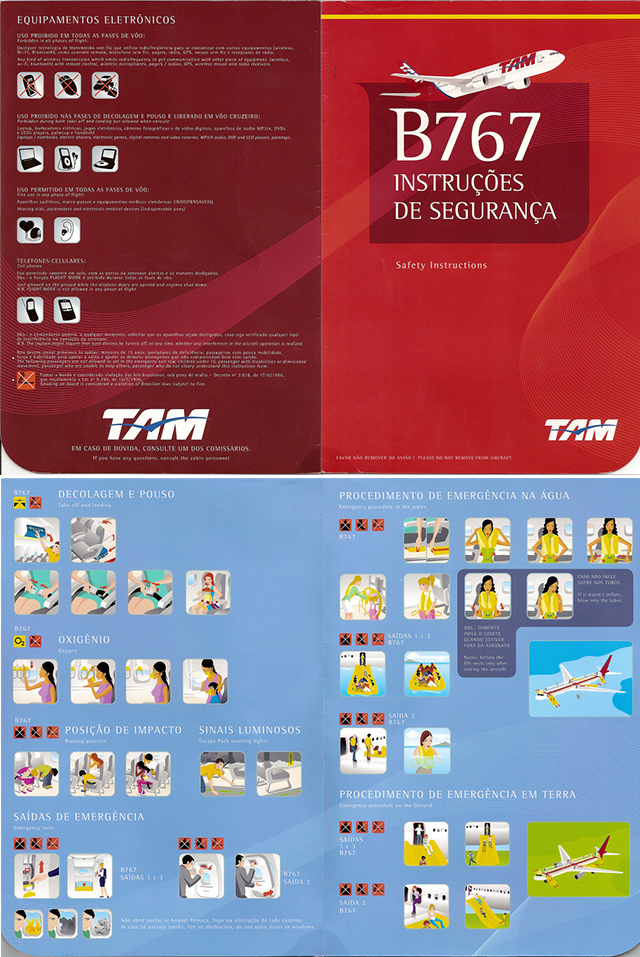
TAM Brazilian Airlines Boeing 767 (2008)
Illustration: Vector Graphic
2010 till Now: Vector Graphic and 3D Figure Rendering are the trend in graphic design of safety cards with varied styles which also strengthen airlines’ brand image.
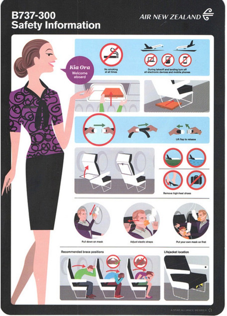
Air New Zealand 737-300 (2012)
Illustration: Vector Graphic
“A Branding Set of Air NZ” is combined with the safety card of Air NZ and the cabin crew uniform designed by NZ fashion designer Trelise Cooper. Matching with cabin color – black & white plus simple line, to emphasize NZ brand image – dynamic, stylish and innovative.
[Recommendation for Further Reading]
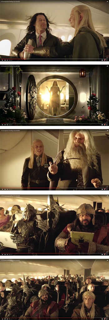
Partnered with WETA Workshop, Air NZ created a Hobbit version of Safety Video “An Unexpected Briefing”. The Hobbit: An Unexpected Journey was filmed in New Zealand and released in December of the same year:
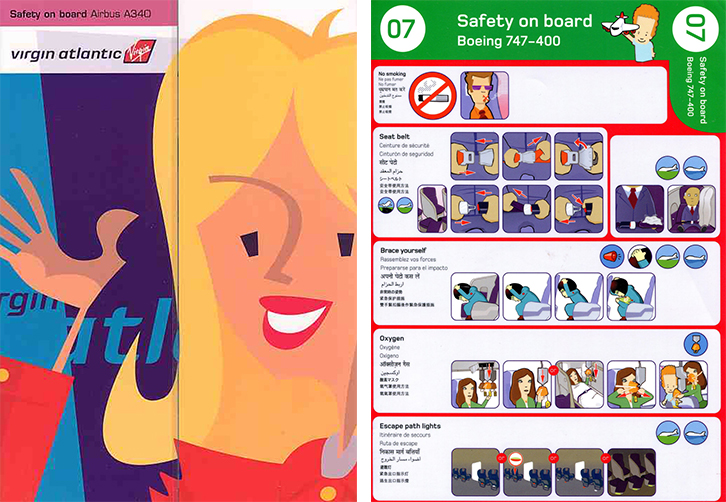
Virgin Atlantic Boeing A340 / 747-400 (2012)
Illustration: Cartoonish (Vector Graphic)
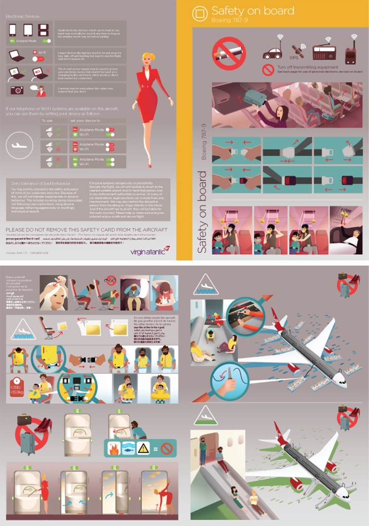
Virgin Atlantic Boeing 787-9 (2014)
Illustration: Vector Graphic
Virgin Atlantic redesigns its publications periodically to reinforce with its brand image, which is innovative, dynamic, stylish and fun. For example, its safety card used cartoonish illustration in 2012 and changed to stylish vector graphic in 2014, which target at youth and middle-aged passengers.
[Recommendation for Further Reading]
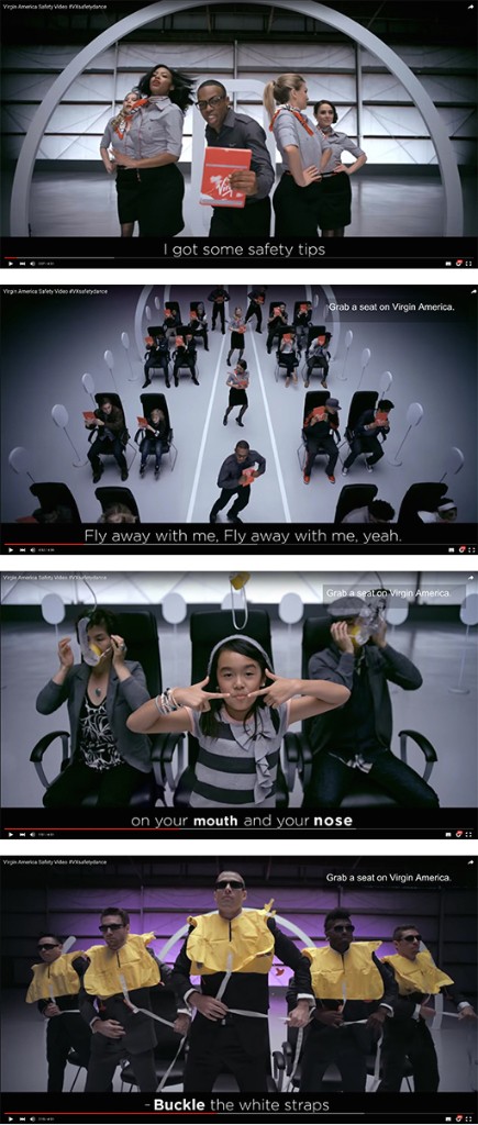
A safety video “VX Safety Dance” was launched by Virgin America in 2013:
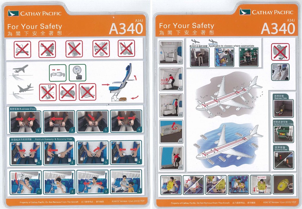
Cathay Pacific A340 (2013)
Illustration: 3D Figure Rendering
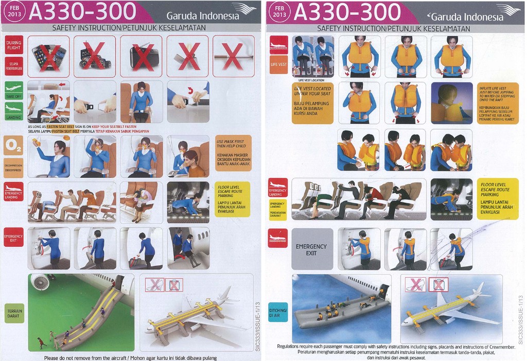
Garuda Indonesia A330-300 (2013)
Illustration: 3D Figure Rendering
Cathay Pacific, the largest airlines in Hong Kong and Garuda Indonesia, the national airlines of Indonesia are both ranked the world’s 5 Star Airlines by Skytrax and were awarded Skytrax’s Airline of the Year. They definitely own the top-class reputation in aviation industry. With their safety card’s design, they’ve both chosen 3D Figure Rendering which shows the extraordinary, formal, dignified and magnanimous quality of their brand.
[Recommendation for Further Reading] Derivative work: Old Things × New Ideas
Can the safety card be more interesting? Through concept conversion, some designers try to apply the classic layout format and symbols of safety card on other products. As the result, a totally different user experience is created.
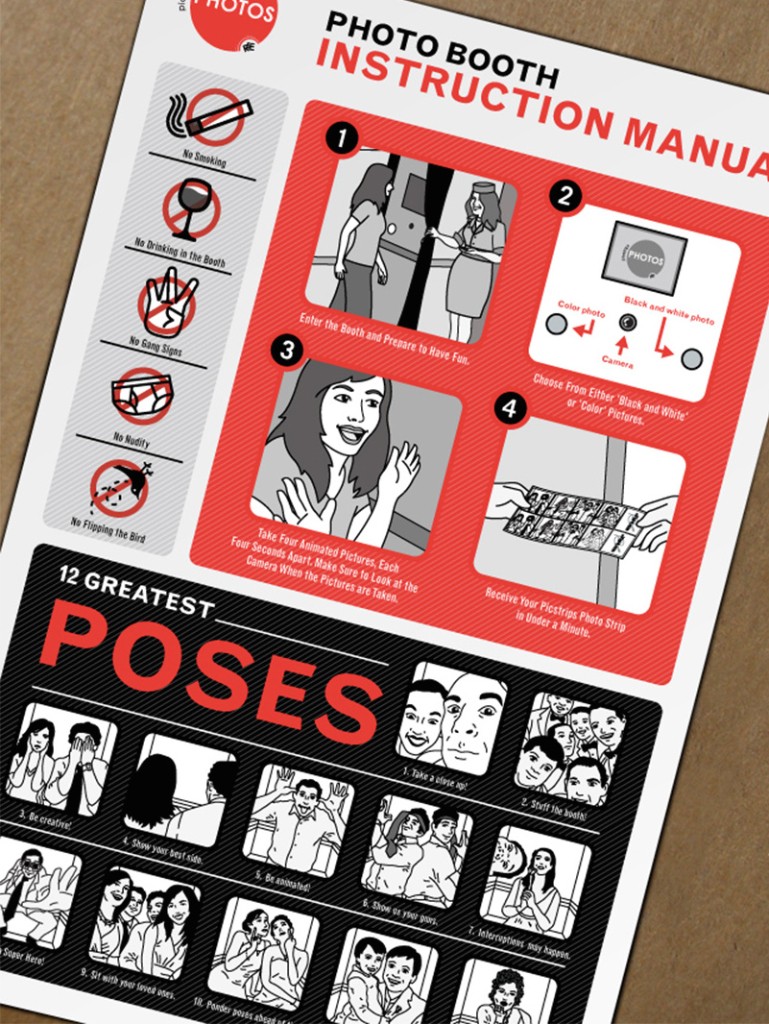
Theme: Photo Booth Instruction
Design Concept: Aircraft Safety Card
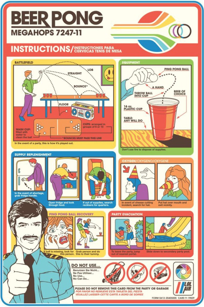
Theme: Beer Pong Party Instruction
Design Concept: Aircraft Safety Card