Movies, music, wifi connection, inflight meals, spectacular aerial view from the airplane windows… With so many entertaining choices onboard, the duty-free catalogue probably is the last thing you would pick up during a flight. According to statistics conducted by Inmarsat Aviation, only one in ten passengers now makes an inflight duty-free purchase, especially when most airlines are providing online shopping today.
Over the years, we have earned our names through taking in charge of the design and production of inflight duty-free catalogues for airlines in the Greater China region. As an inflight magazine design specialist, it is our mission to make high-impact duty-free catalogues that influence passengers to make purchases. Today, we would love to share with you our insights into duty-free catalogue design and how we leverage our creative skills to make them appealing to the eyes using the design example of U.shop (2019 Apr-Jun Issue) – the inflight duty-free catagloue for HK Express, Hong Kong’s first low-fare airline.
1) Stick with the Brand Identity
The duty-free catalogue is one of the Airline’s brand products, it is therefore important to ensure the design sticks with the visual identity of the airline to uphold its uniqueness, while keeping the style consistent.
HK Express’s website reflects the brand identity through the Swift bar, icons, colours.
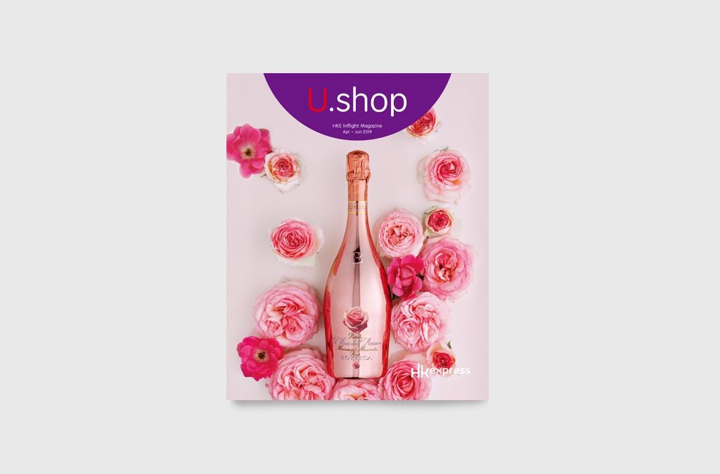
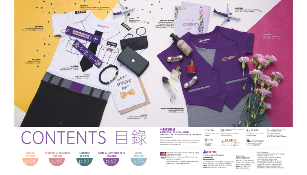
The masterhead & semi-circle on U.shop cover is one of the airline’s visual identity elements.
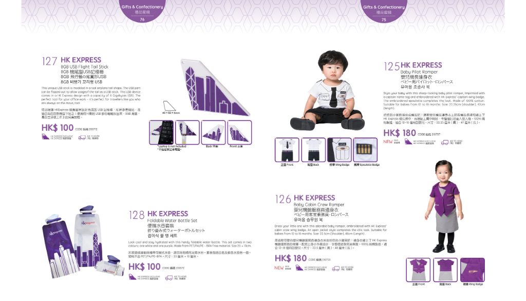
U.shop ‘Gift & Confectionary’ section – the products are set out on the airline’s recognisable purple pattern.
From the cover to the content, the catalogue retains the signature shade of HK Express – deep purple – and follows its brand guidelines, subtly showing the brand identity with a careful selection of fonts, colours and the use of HK Express’ fundamental visual elements inspired by the Swift bar.
2) Selection of Colour
A sophisticated colour set plays an important role in catching the readers’ attention. Imagine if the magazine is in monotone, how boring would it be? Right choices of matching colours not only help add a sense of aesthetic, but also create a product category system for the readers’ convenience.
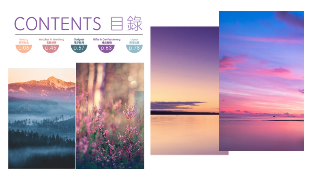
Brand colour aside, the colour set in U.shop is used to create a soft, delicate and subtle atmosphere. Each colour is extracted from the scenic views found in vacation destinations to represent each category, e.g. the sunset glow, lavenders, colourful horizon. The set of colours suggest a sense of subtle anticipation that leads to an enjoyable and relaxing journey or the excitement follows after.
3) Create an Air of Simplicity

A minimal design that keeps everything simple and neat is an aesthetic choice. It sometimes works better than an overwhelming design. In U.shop, the design of the inner pages is reduced to its simplest form to give off a sense of sophistication. We ensure there is sufficient white space to improve comprehension and guide readers through the pages, especially when there is a heavy load of products.
4) Use of Infographics to Display Information
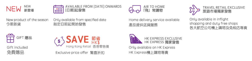
An inflight duty-free catalogue contains not only product description and price, but also other useful information. However, giving the whole lot of information in text format would only stop people from reading. That’s why we have created a set of special labels to indicate new products, exclusive products, special gifts and other information in the brand colour of HK Express completed with round corners and red dot details. The ‘Exclusive offer’ and ‘New’ icons are also made eye-catching to drive positive sales.
5) A Well Laid-Out Product Photography
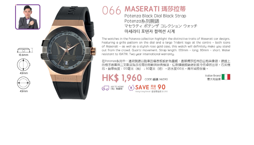
Hundreds of products are included in a duty-free catalogue. To help certain featured products stand out, we create well laid-out photos with a theme corresponding to the months of release, while making sure the presentation goes well with the visual identity of the airline. With a simple backdrop and some props, we help certain products to pop out in a ‘less is more’ composition, without making the whole presentation too busy. Inserting the product photo in the first two double-spread pages will have readers staying on the pages longer, as well as leave a good impression on passengers.
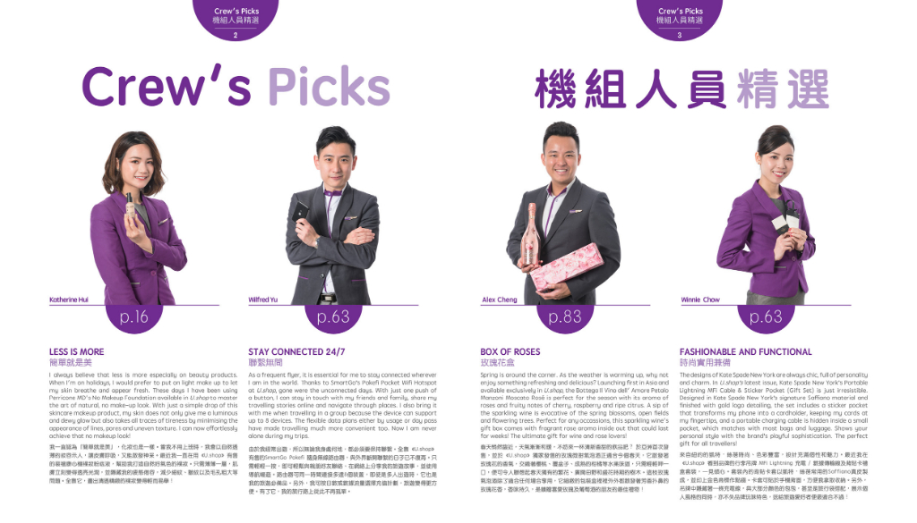
Apart from the product photography on the first two pages, photos of the crew holding the featured products with their reviews on the products are placed after, which help show the actual size of the products as well as keep the passengers engaged, thus encouraging them to shop in the air.
—————————————-
We could be your creative energy that goes into your duty-free catalogues, inflight magazines or any kinds of publication. Simply drop us a line at info@ccplusmedia.com or +852 3460 5052 and we will be more than pleased to assist you.