Have you ever started to grow interest for a brand that you never batted an eye because of its new image?
Your sudden surge of interest for a brand is probably the result of the fresh look. The society is changing rapidly in this digital era. With so much information bombarding us every day, the trends and people’s tastes are changing fast. New brands are trying to take the stage and earn people’s attention though products that match their tastes. Brands who have already established their names years ago may feel the need to rebrand to keep up with the trend and the competition, and to appeal to the society. Some companies rebrand also because they want to reach a broader audience or they are launching a new product line.
Rebranding is so much more than just giving a new name, a new logo or a new design to an already-established brand. A lot of work goes into rebranding: a thorough view of a company’s mission, values and vision, a research of the competitors in business, the trends in the market, a careful decision on what to keep and what to discard from the current branding, etc. For a full-on rebrand, an all-round strategy that covers all elements, e.g. logo, packaging, poster, and communication channels of a brand, e.g. social media, traditional media, should be developed. Whether it’s a full-on rebrand or just a brand refresh, the new presentation should speak to the company’s core values and identity.
Now, let’s take a look at the new faces of some brands, starting with our local ice-cream brand.
NESTLÉ®Ice Cream — Bring us back the classic packaging in the 70s
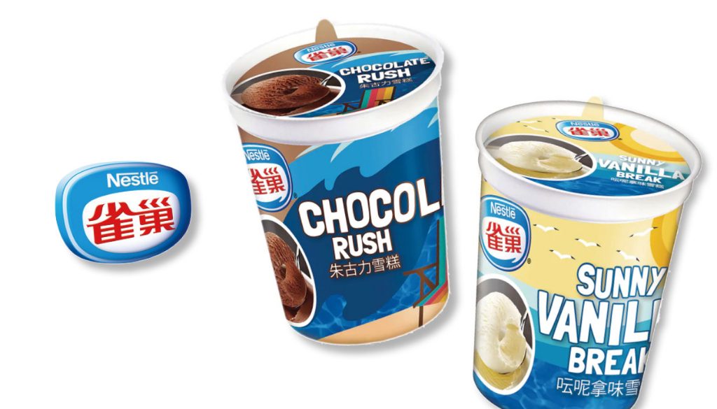
Nestle ice cream is no stranger to you if you are born and bred in Hong Kong. One of the best parts of our childhood is probably eating Nestle ice cream with our friends and family. With a long history since 1993, Nestle, however, may be a bit dated today and its ice cream perhaps no longer be at the top of our list thanks to the imported ice cream craze.
To win people’s heart back, Nestle Hong Kong had given a makeover to its ice cream collection by leveraging its history and Hong Kong people’s memories, and launched the products with retro packaging designs to brings us back to the 70s and 80s, as well as to recall local’s memory of the brand.
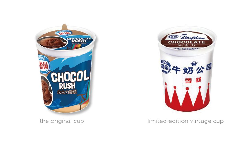
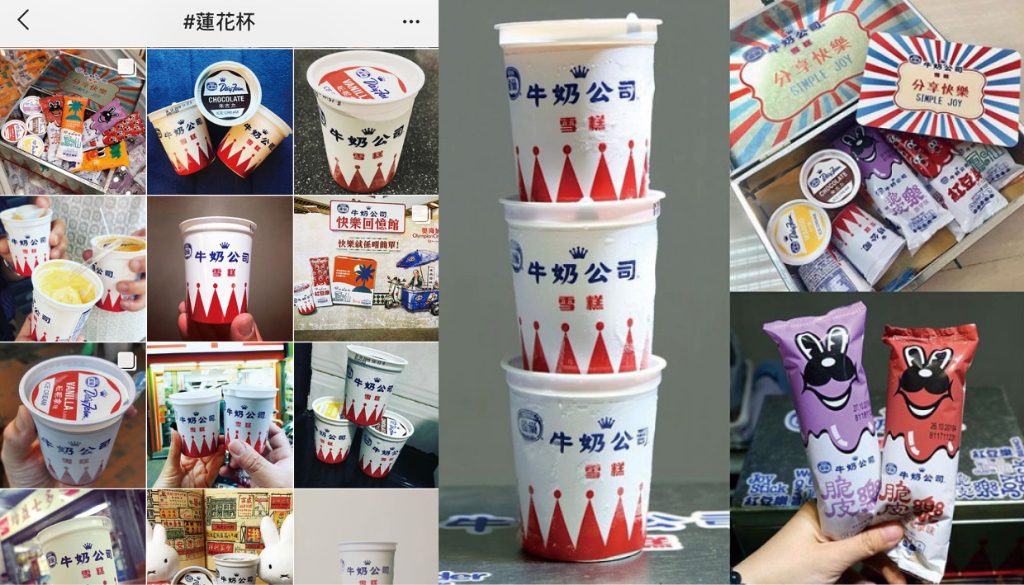
The concept is all about ‘retro’. Referencing the iconic ‘lotus’ ice cream cup which was popular in the 70s and abandoning the blue-themed stylish design in the 00s, the new ice cream cup comes in red and white with a vintage-looking calligraphy font and a red crown pattern, evocative of Hong Kong people’s collective memories.
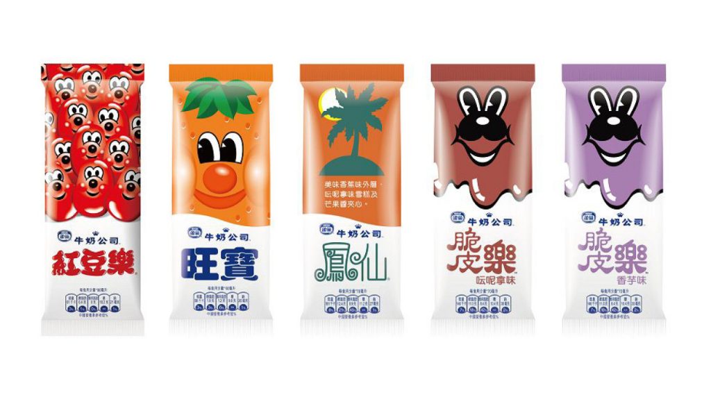
Other ice cream products also get a wardrobe change that communicates the retro concept. The type, colours, logo and the characters representing the products remind us of the 70s-80s. Awww, how much I miss nagging my mum to buy me these ice lollies when I was young …
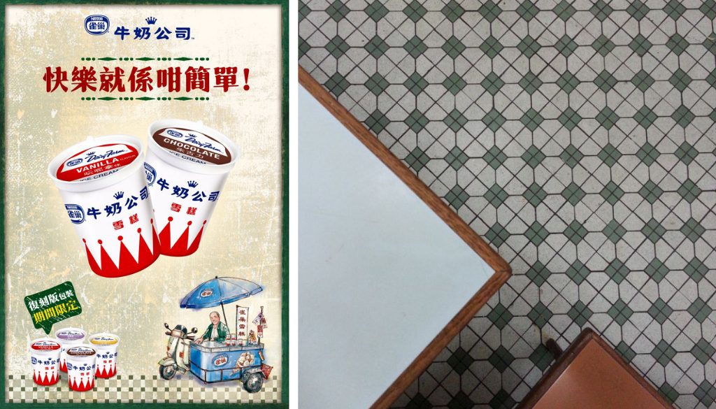
Reminding us that happiness can be as easy as eating a cup of ice cream, the vintage poster designed for the campaign features an old-school ice cream cart that could be seen around Hong Kong in the 70s-80s. The grunge texture, green-yellowish colour tone and the tile pattern are also reminiscent of the interior of local ‘tea restaurant’.
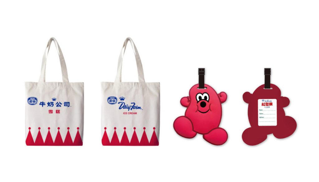
To complement the campaign, Nestle had organised an exhibition covering Nestle’s memory in Hong Kong back in June. The company had also designed two limited souvenirs, featuring the iconic crown pattern and the ‘BEANO’ cartoon, for its fans.
Instagram / @foodcaptain.hk
Vintage and retro-style are on trend. Thanks to the ‘new’ faces, the products become very ‘instagrammable’, and the status of Nestle had been consolidated.
Krispy Kreme — New brew & cups
If you have a sweet tooth, you must have heard of Krispy Kreme, an American global doughnut company who had once set its foot in Hong Kong for two years. Krispy Kreme is world renowned for its delicious doughnuts, and its visual identity is also widely recognisable: the signature green packaging, the iconic green dots, the well-known logo … Here’s a fun fact: each green dot on their box represents a doughnut.
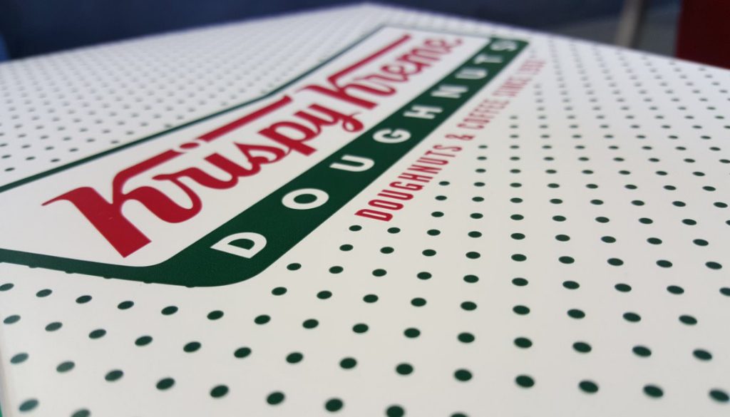
Image: Krispy Kreme / https://www.krispykreme.com/
You must think people stop by Krispy Kreme for their doughnuts only. However, doughnuts aren’t what all you can get in Krispy Kreme. Little do people know that Krispy Kreme, in fact, serves great-tasting coffee too.
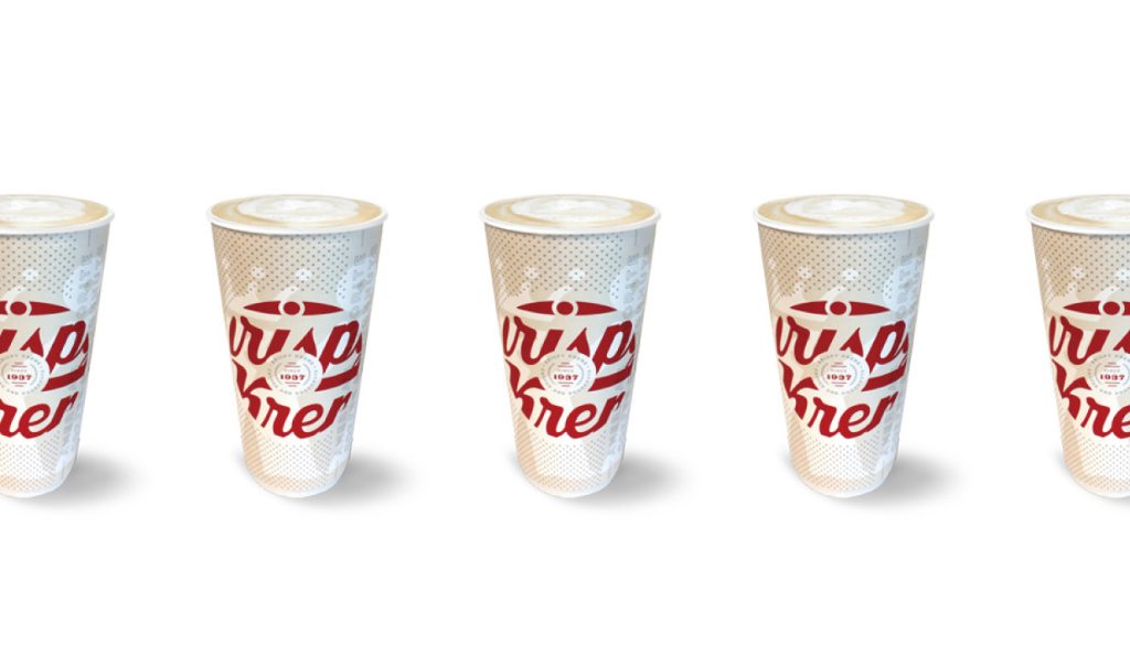
To ‘re-introduce its coffee beverage platform to customers’, Krispy Kreme had launched their new coffee cup with their reformulated all-new brew, Smooth & Rich, to announce that their coffee is now ‘new & different’.
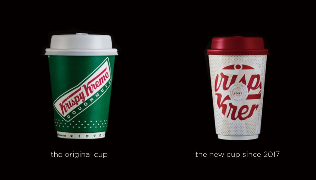
Taking inspirations from Krispy Kreme’s 80-year heritage, the new coffee cup with wine red elements had taken people by surprise as it had abandoned the dominant green and signature logo.
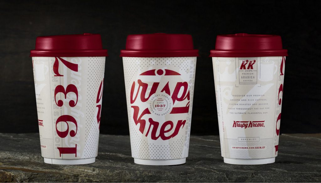
The front of the cup features the brand’s wordmark that is cropped into a doughnut shape. On the side is 1937, the year of establishment of Krispy Kreme. The new design is ‘to communicate 5 things: coffee, premium quality, fresh, authentic and crafted’.
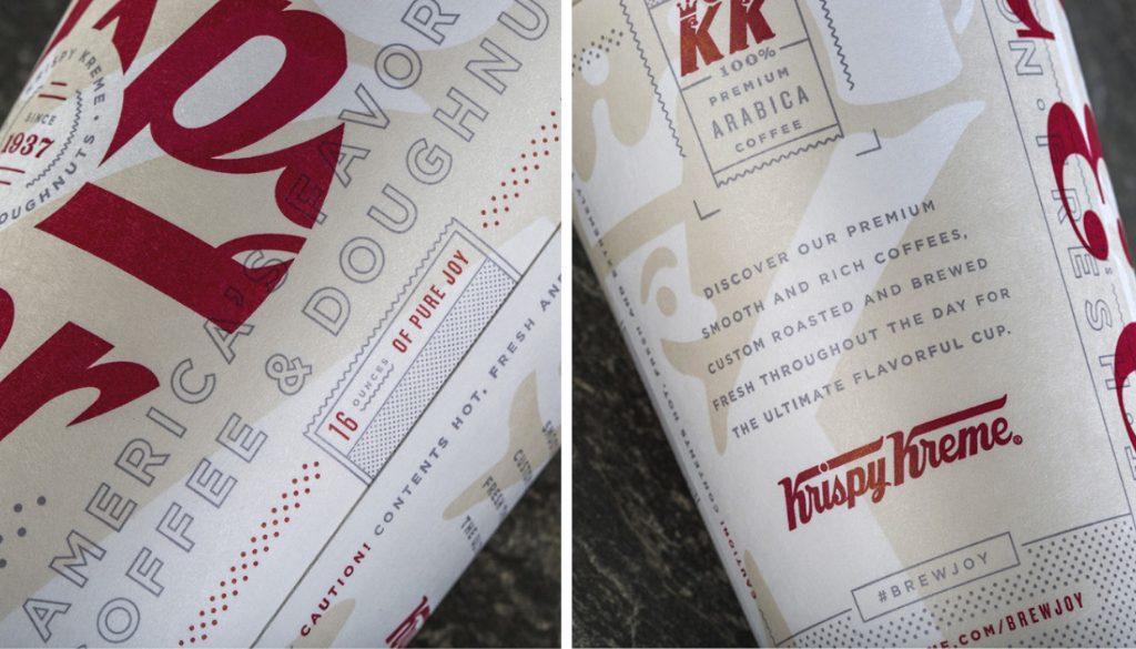
Departing from the iconic green, the new coffee cup was designed to look like it belongs in the 90s with the stencil font, grey dots patterns and fine decoration lines.
The new cup speaks the history of the brand well and is able to create a new buzz with the refreshing image, probably effective to reach potential new audience too. However, some people found this new design unattractive as it looks a bit overdone with the elements scattered all over the cup. It had also lost its ‘familiarity’ and makes people hard to tell if a person is drinking Krispy Kreme’s coffee because the new design had ditched the iconic green and the wordmark was cropped into the shape of a doughnut. There is no ‘I want Krispy Kreme coffee too!’ when we see someone with this cup.
What about you? Do you find the new design attractive or find it a failure?
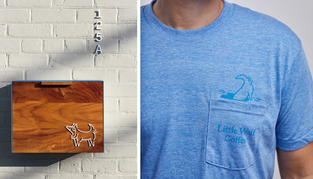
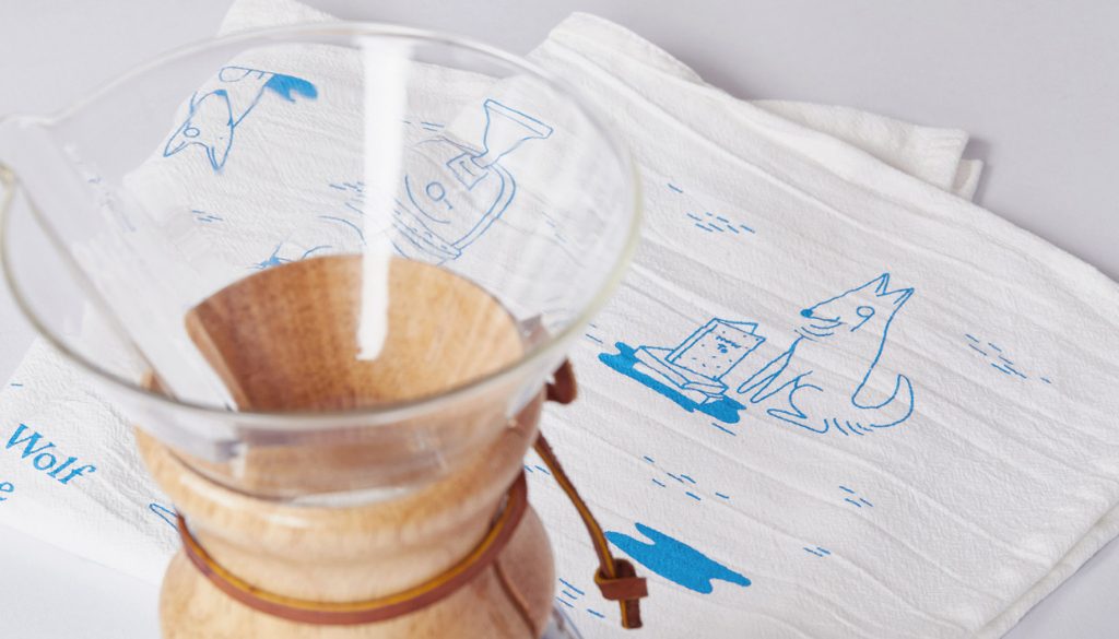
Little Wolf Coffee – Cute new image from head to toe
Little Wolf is a coffee roastery in the United States selling specialty coffee. The coffee shop is named after the owner’s best companion, River, a husky who looks like a wolf.
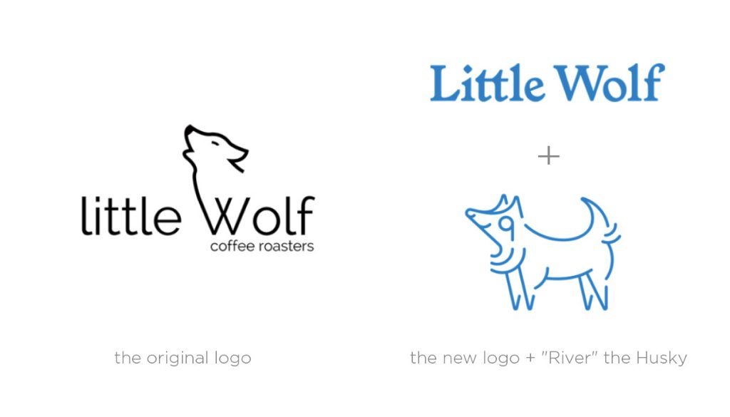
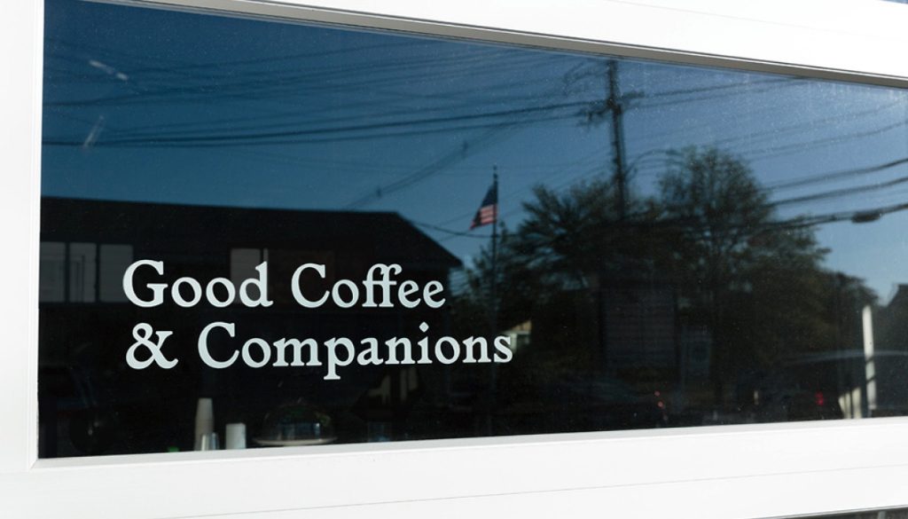
The original logo is monocolour, with an endearing font and a wolf spawned from the ‘W’. It was cute, but not impressive enough. The design company Perky Bros had therefore given the tiny coffee shop a new logo and a new identity to communicate the ‘Good Coffee & Companions’ concept according to the owner’s desire to make the roastery, as well as specialty coffee, more friendly.
The new logo is formed by a wordmark in a serif font that is likely to be used in English classic storybooks and a lovely illustration of River wearing a monocle (Some say it looks like number ‘9’ though). The two elements never appear as a lockup. We see the wordmark and River on its own, but the two are somehow connected when used on the identity items.
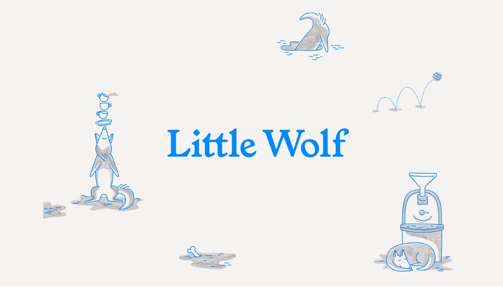
‘The design’s inspiration is one part science and two parts storybook. The system showcases a methodical, yet quirky typographic system and a restrained icy blue color palette reminiscent of the eyes of a newborn wolf pup. Our protagonist River can be found playfully illustrated throughout the identity as the loyal shopkeep—reminding everyone that specialty coffee shouldn’t be taken too seriously.’ – Perky Bros

The icy blue thin line illustrations are complemented by marker shading to create a storybook-like style.
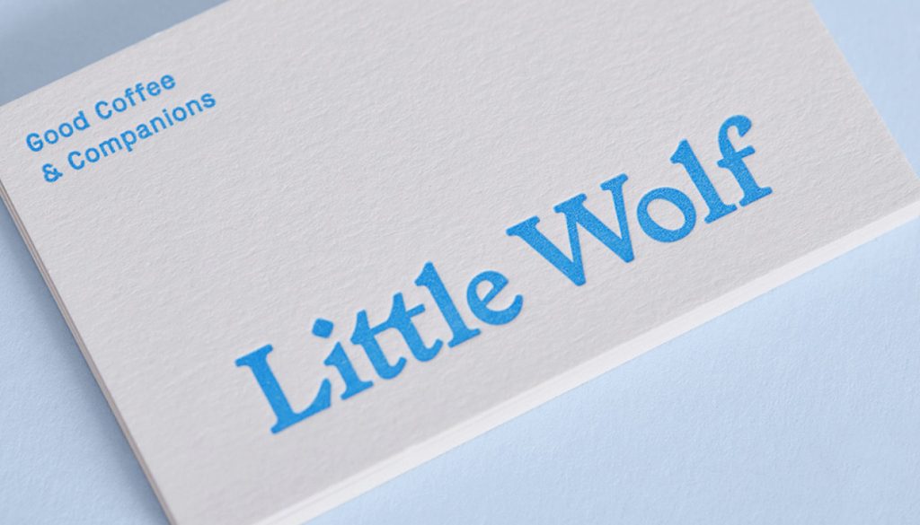
The business card of Little Wolf is neat and simple with the icy blue wordmark.
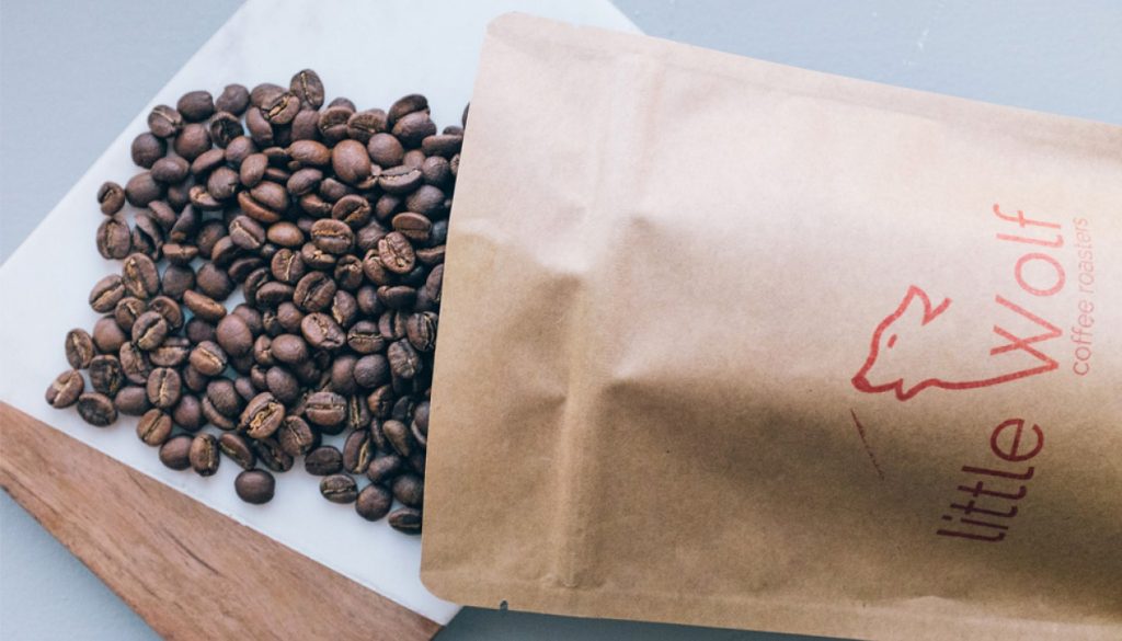
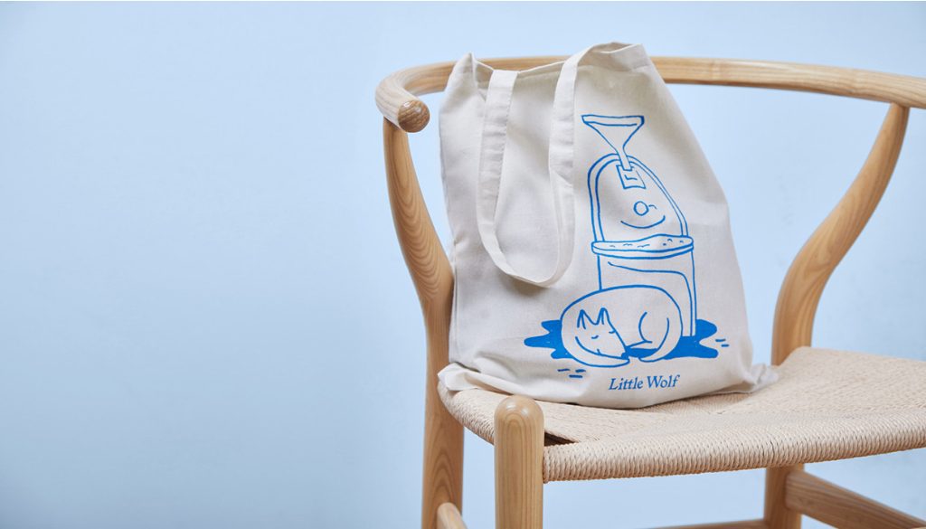
Like many individual stores, their packaging is simply a brown paper bag with the logo printed on the front.
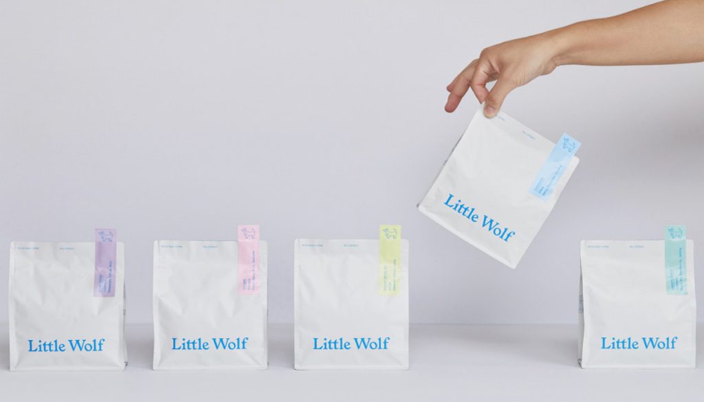
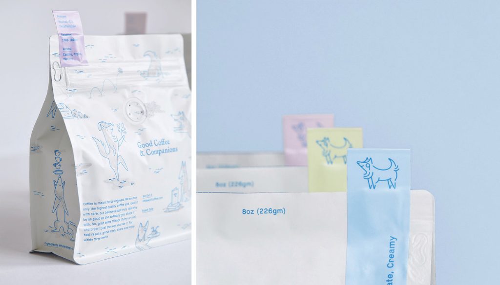
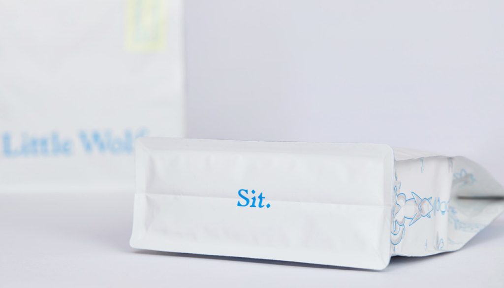
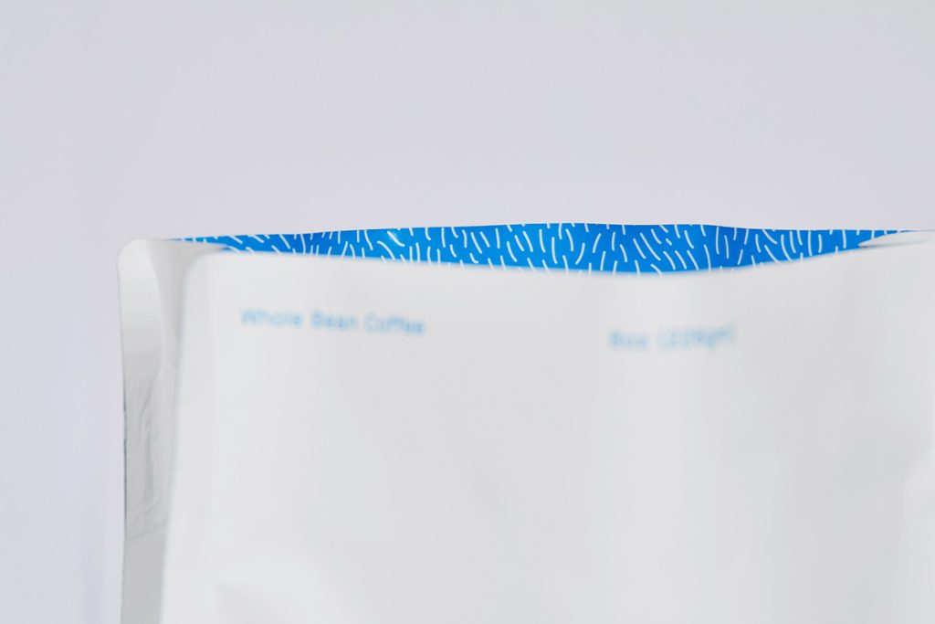
The new packaging is cute in its own way with great attention paid to each side of it: the River illustrations on the back and on the sides, the ‘sit’ on the bottom, the wolf hair pattern lining, the coloured stickers for the coffee variety. Using coloured stickers is also a smart move because the roastery can save money by customising only the stickers, instead of the bags.
Shop Interiors & other components:
The rebrand has injected the roastery with playfulness and friendliness. The illustrations are adorable that they make people smile. The roastery might as well consider getting into the children’s publishing! However, some say people will confuse the new image with dog food or pet shop. What do you think?
Sources of Information & Image:
https://www.nestle.com.hk
https://www.krispykreme.com
https://www.underconsideration.com/brandnew
https://perkybros.com/portfolio/little-wolf-coffee/