When we talk about Japanese designs, what first come to most people’s minds is the creativity and imagination that change the way we look at things. When we talk about Japanese design houses, design lovers would first think of nendo, a creativity force led by designer Oki Sato.
‘nendo’ means ‘modelling clay’ in Japanese, meaning as pliable, free, flexible and versatile as clay can be. Although modelling clay seems insignificant, they can result in endless possibilities. The job of nendo is like creating stunning creations from clay.
This is what nendo says on its website …
‘There are so many small “!” moments hidden in our every day. But we don’t recognize them … But we believe these small “!” moments are what make our days so interesting and so rich. That’s why we want to reconstitute the everyday by collecting and reshaping them into something that’s easy to understand … Giving people a small ‘!’ moment. That’s nendo’s job.’
nendo’s designs play around minimalism, a traditional Japanese concept that has been associated with Japanese designs for long, and exhibits the depth upheld by Japanese products. Taking inspiration from daily lives, nendo transforms its ideas into friendly and fun designs that make us ‘!’. Now let’s take a look at some surprising designs by nendo recently.
Beautiful and Practical
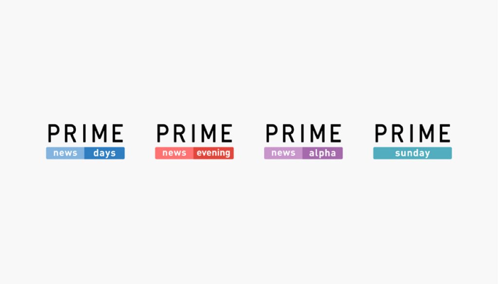
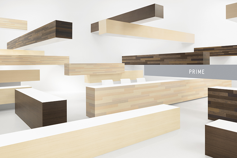
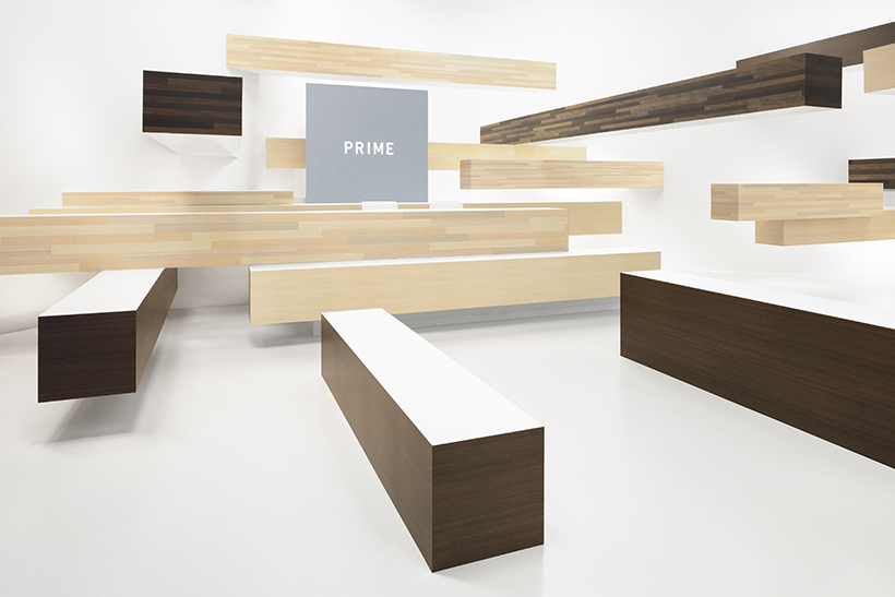
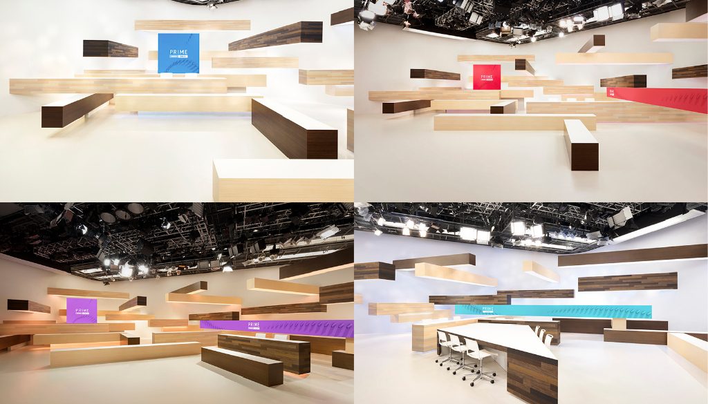
Fuji Television – PRIME News
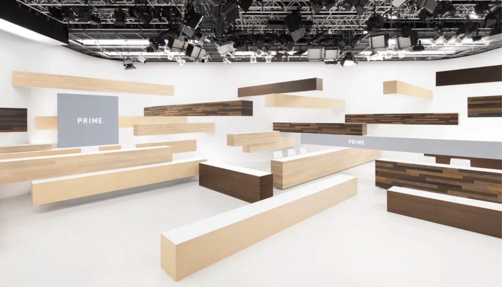
nendo had offered Fuji Television’s PRIME News new key visuals and studio sets to go with the program revamp. PRIME News come in four sessions: ‘days’, ‘evening’, ‘alpha’ (late night) and ‘Sunday’. A primary colour is systematically applied to each session based on the colour of the sky at the time of broadcasting: sky blue for the day, crimson for the evening, purple for the night sky and emerald blue for Sunday morning.
To goal of the studio set’s design is to cope with the needs of the news program through increasing the functionality and flexibility of the interior. The wooden bars are presented in two different colours to puts the audience into a different state of mind when the program is filmed from different angles. When the camera films from the right, the natural hue exhibits a feeling of intimacy and comfort; when the camera films from the left, the dark woods exude calmness; when the camera films from the front, the two colours create a vibrant result in harmony. The bars are positioned at different heights, so that different standing and sitting positions are made available for the anchors.
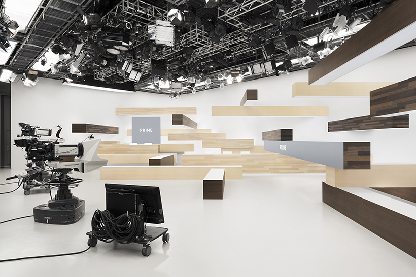
A 2000mm2 monitor and a 9m monitor are installed in the studio set to display information. The monitors can change colours according to the program sessions, giving a sense of individuality and unity to each session at the same time.
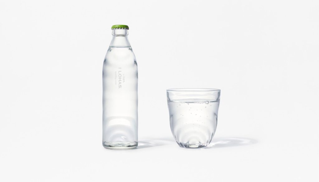
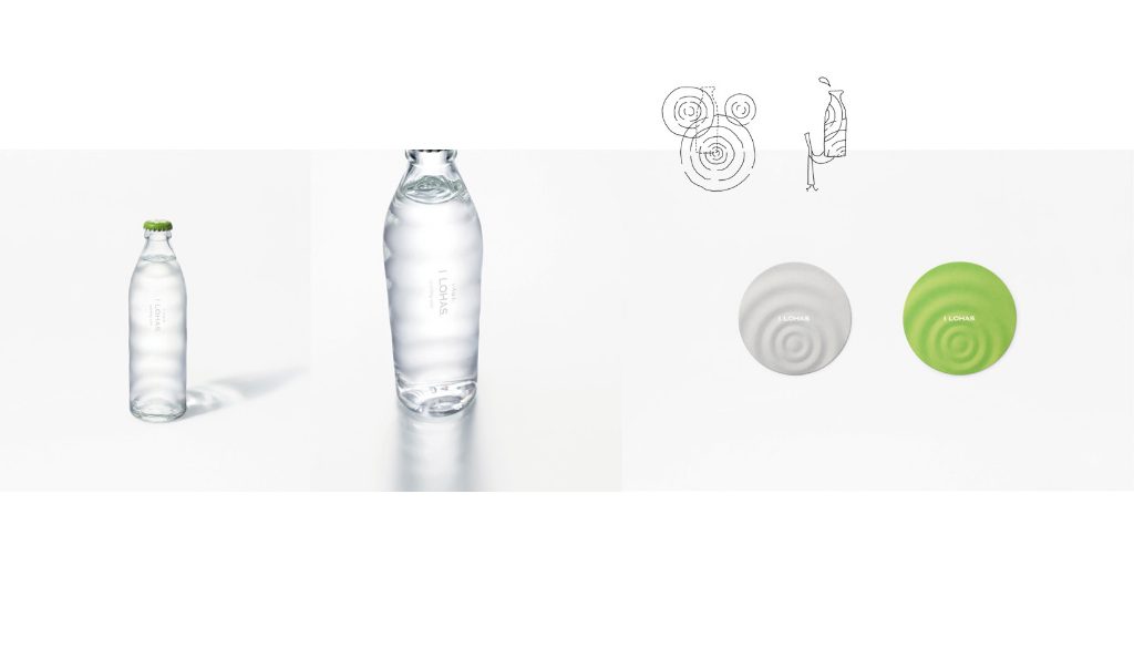
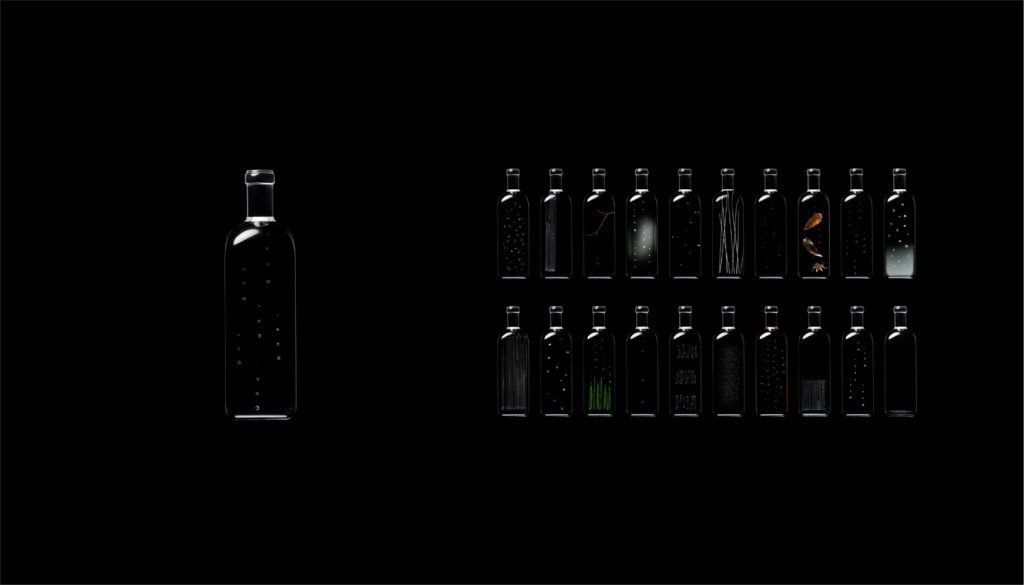
A Water Bottle with Ripples
Coca Cola & nendo – I LOHAS glass sparkling water
You may ask how do the exuberance of Coca Cola and the simplicity of nendo strike sparks off each other? To find inspiration for Coca Cola’s new glass sparkling water, nendo observed the surface of natural spring water and noticed there are several ripples moving across the surface of the water. Referencing the dynamic forms of ripples, a glass bottle covered with ripples was designed to give the sparkling water full of liveliness. The unevenness of the bottle also has a non-slip effect. To emphasise Japanese aesthetic, the produce name on the bottle is arranged vertically, and single colour print is used to bring out the purity of the water. A dedicated glass and a coaster with the same ripple pattern were also designed.
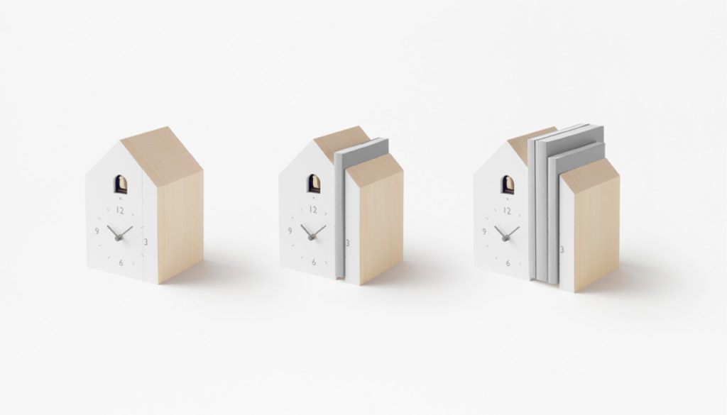
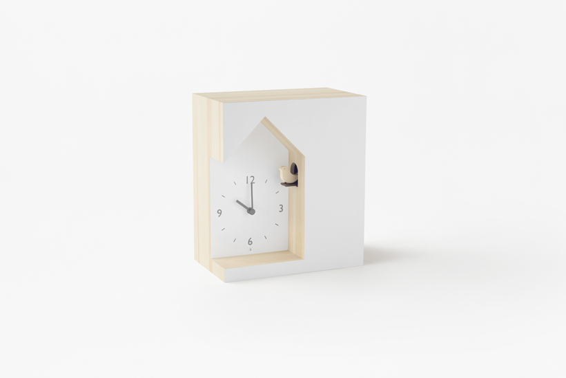
One-of-a-kind Cuckoo Clocks
Lemnos – cuckoo-collection
nendo broke the conventions and had designed three unique cuckoo clocks that look nothing like traditional cuckoo clocks.
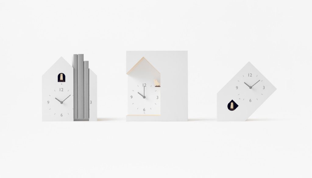
The first clock can be used as a bookstand where the clock dial can be split into two parts. The clock and books can co-exist harmoniously on the shelf, as if symbolising that reading books has no time constraints.
With changes made to the angle of a traditional clock, the second clock is tilted and placed upside down, creating an unusual angle. To maintain its balance, the heavier internal components are placed asymmetrically on one side.
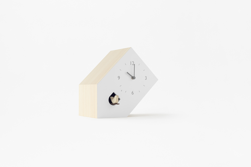
The third clock looks like it is craved out of a book. It also resembles the house of the cuckoo bird that it peeks out from the small whole when it is time.
A Cup with Many Faces
Diamond Inc. – not just a cup
A cup by any other shape would still be a cup as long as we can use it for drinking. Featuring ‘a cup’ as the main character, this children picture book by nendo draws on the story of cup as it notices a spoon is missing to stir the coffee and tries to change its shape to solve the problem. The book conveys a message that designs are not only about beautiful shapes, but about solving the little inconveniences in our everyday lives with new solutions.
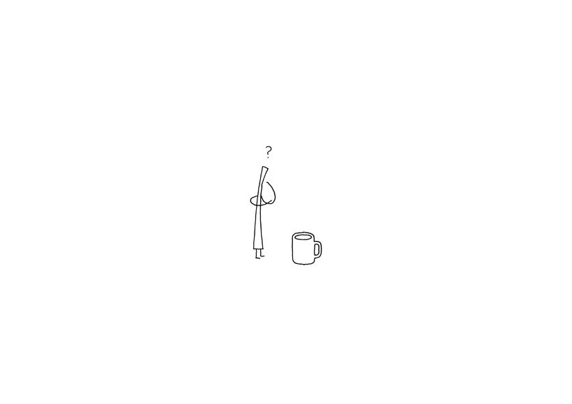
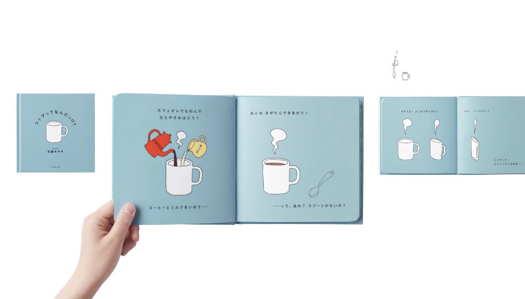
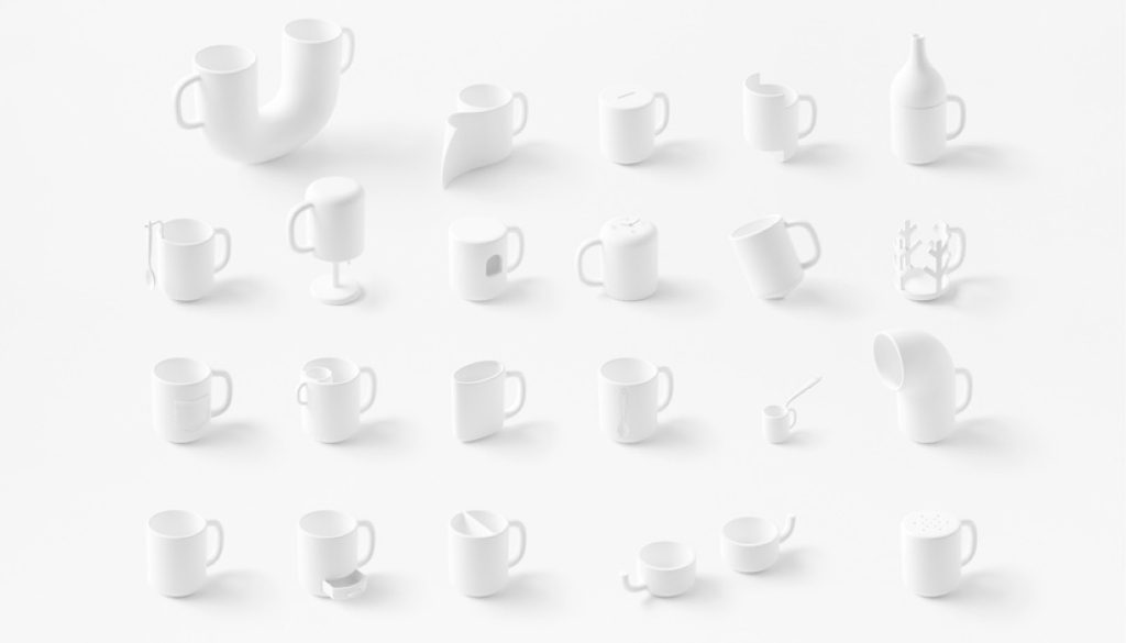
Cup models referencing the different forms of cups in the storybook.
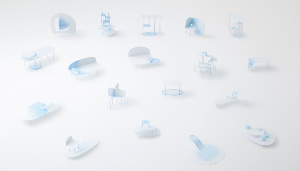
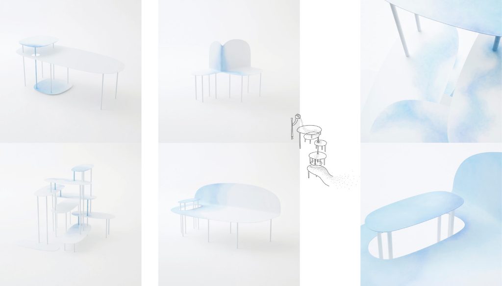
Hues of Blue in the Midst of White
Friedman Benda- watercolour-collection
The beauty of watercolour lies in its properties: it flows over the paper, leaves its track, soaks into the paper and dries. Inspired by the fluidity and translucency of watercolour on a paper surface, nendo designed 18 pieces of metal furniture that look like watercolour-painted paper in terms of the cutting, texture and colour. A lot of effort is put into the making of the furniture: First, the surfaces and the metal frames are repeatedly sanded, then applied with primer paint and finished with matte white paint to express the idea of ‘paper’.
The colouring process was done by hand: First, mix two tones of aqueous ink and tap the paint gently over the surface with soft pulp paper to create the effect of watercolour bleeding over paper. The painterly effect leaves a calming and soothing impression. Each piece of furniture is adorned with unique watercolour patterns and stains with different shades. When certain pieces of furniture are placed on top of one another, the paint that blends in meeting points and overlaps seems if as dripping down like a waterfall.
Some other remarkable designs by nendo:
‘jellyfish vase’
Jellyfish-like vases that can float in water
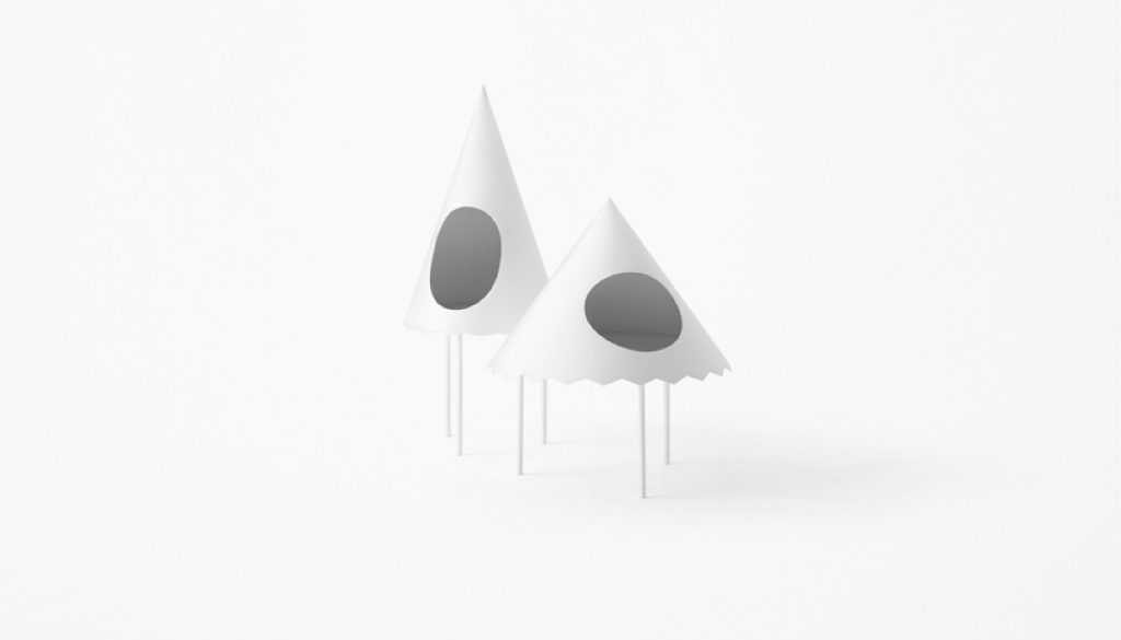
‘tent’
Side tables which looks like tents. The round-shaped opening can be turned around and have inner lighting, which make the table a personal alcove.
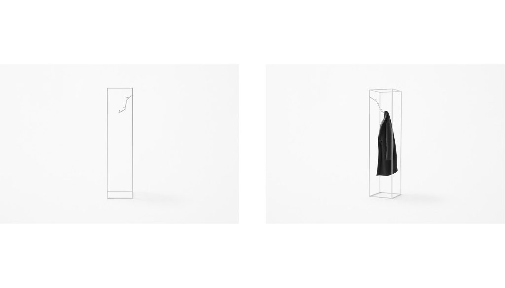
‘koeda’
A clothes rack that replaces the traditional hang with a ‘tree branch’, which grows inward while branches usually grow ‘outward’, and the clothes are hooked ‘inside’ the coat stand whereas they are usually hooked ‘outside’. The design that reverses the concept of ‘inside’ and ‘outside’ increases the stability of the clothes rack.
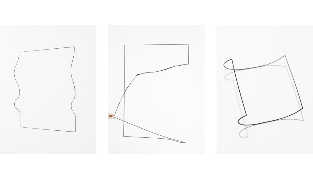
‘un-printed material’
Black frames that simulate different forms of paper
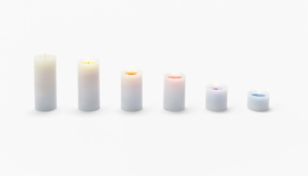
‘sunset’
A candle that captures stages of sunset. The candle changes its colour as it burns. Each colour represents a different colour of the sunset sky as the sun goes down, and comes with its own scent.
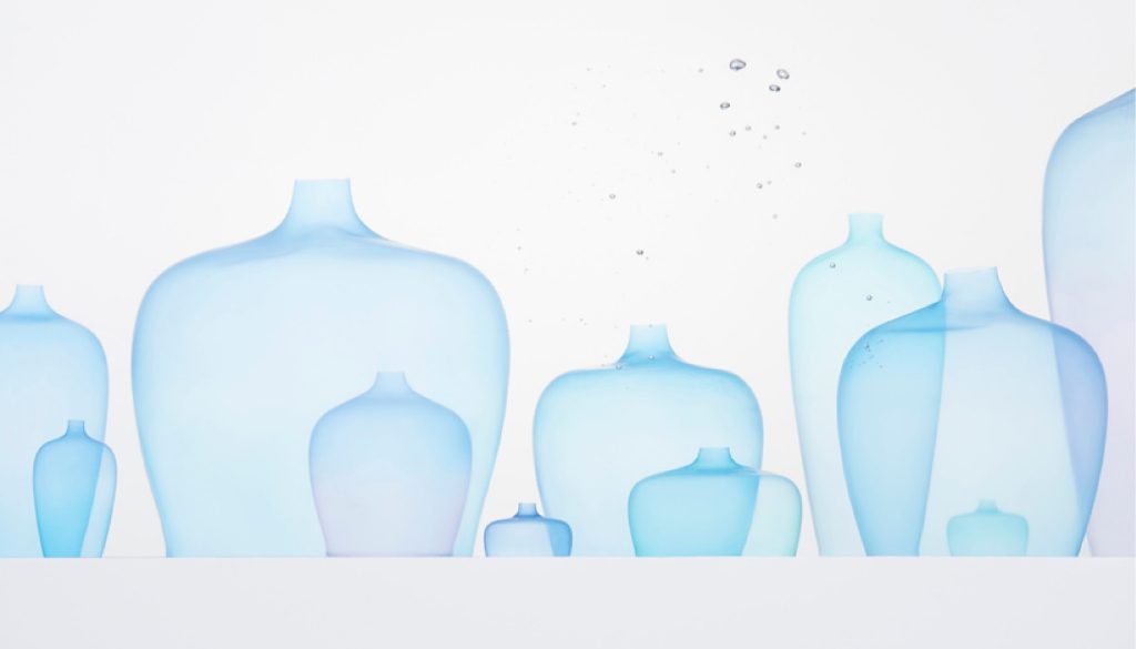
‘rainbottle’
a bottle that captures types of precipitation
Source of information & images:
www.nendo.jp