As you flip open a magazine or a book, I bet most of you would skip the table of contents and dive right into the chapters. The table of contents is believed to be the least interesting part in a publication, given that most traditional designs list only the page numbers, chapter titles and items that bore the readers. In fact, a table of content can be beautiful and creative without compromising its functionality.
There are four major elements when it comes to table of contents design: ‘Photo’, ‘Text’, ‘Graphics’ and ‘White space’. ‘Photo’ means photo selection and editing; ‘Text’ means typography, the technique of arranging type to make it readable and appealing; ‘Graphics’ mean the images that complement the text; ‘White space’ means the unmarked portion of a page that helps direct the readers’ attention. Here are 20 ideas that have put these four elements to good use to turn the table of content into an eye-catching and readable one.
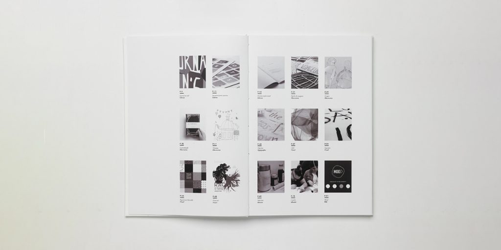
Photo Index
Play with shapes and space
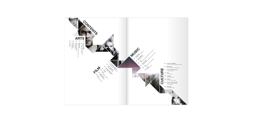
This table of contents was inspired by the brand’s logo that is made up by triangles. Photos from the chapters are cropped into a chain of triangles, diving the page in two diagonally. It is a creative way to communicate the brand’s image.
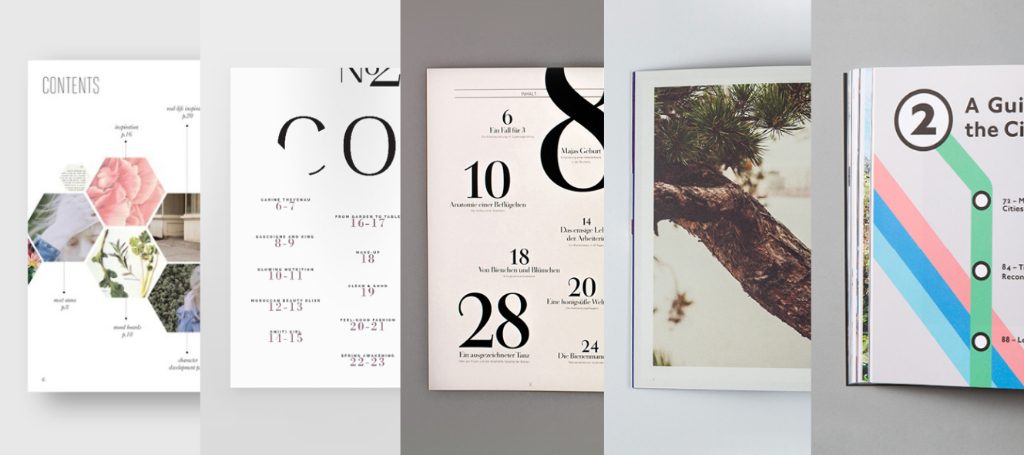
Honeycomb layout
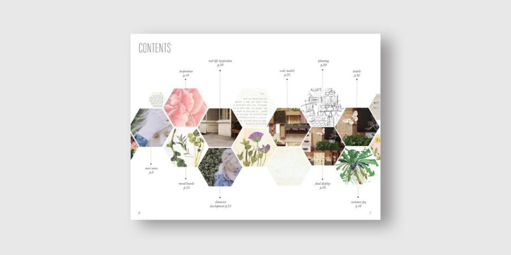
Fill the honeypots with preview images. It is an interesting and usual way to present the information with a honeycomb layout.
Use preview Images

Besides brief descriptions, you can use preview images that serve as a sneak peek in the table of contents to make your layout shine.
Use columns
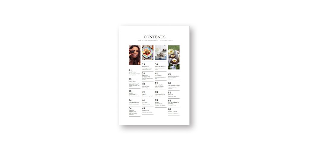
Divide the layout into four columns and pick a representative photo for each. See how the magic turns the table of contents an easy-to-navigate and beautiful one?
Make it like an Instagram
Make your table of contents like your own Instagram. Create a decent Instagram feed by picking a consistent colour palette and size for your photos, with page numbers and chapter’s name below each photo.
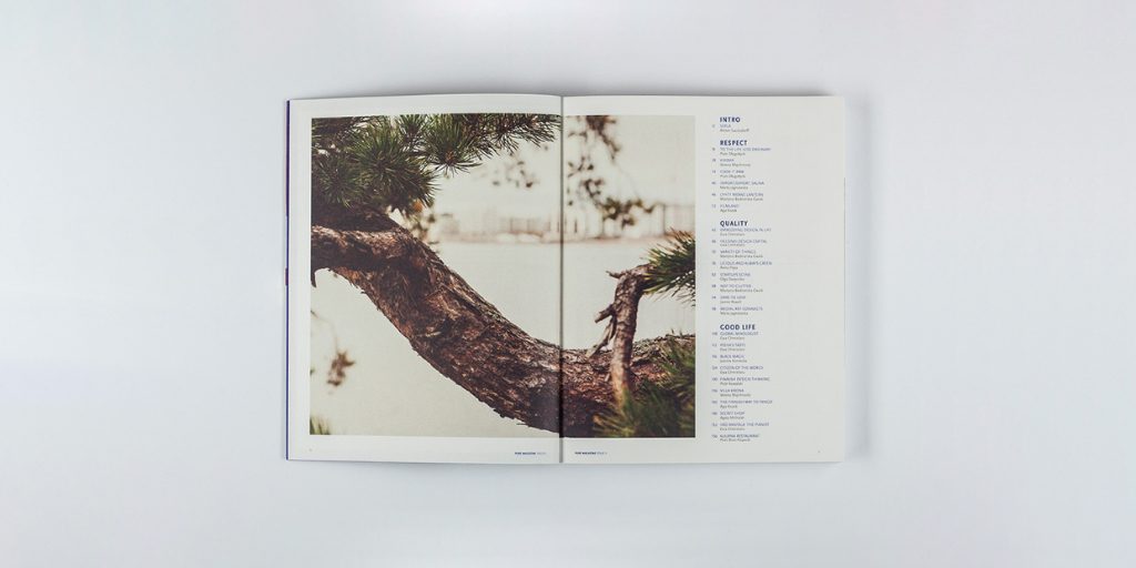
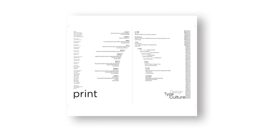
Open Space
Compared with a table of contents that is tightly packed, leaving enough space gives your readers rooms to think and imagine, lending a clean layout that is comfortable to the eyes.
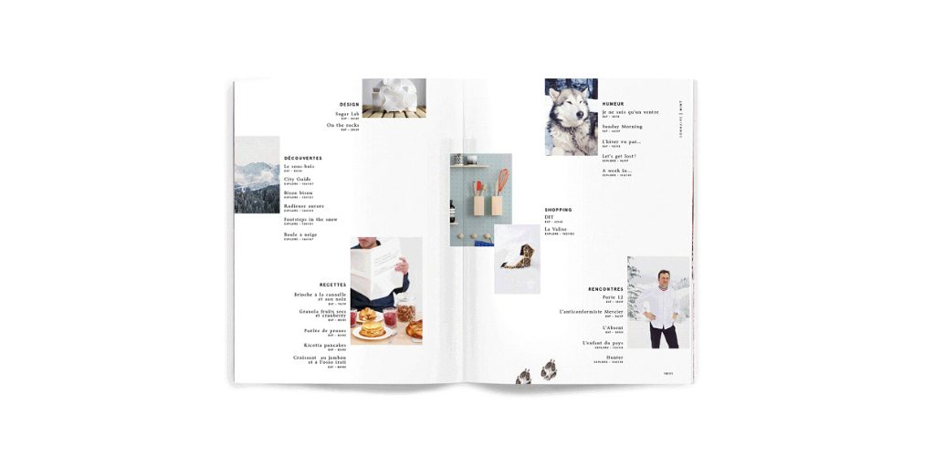
Gallery Style
Consider creating a gallery wall by inserting a different number of preview images into each column. See? There comes a beautiful picture.
Use a large & eye-catching
Catch your readers’ attention with a large and eye-catching photo and your table of contents aligned on the remaining ¼ space. It gives the page a clean and neat look.
Typography
Back to basics: B & W
Black and white are the epitome of timelessness, subtlety and simplicity. Incorporate these two colours into your pared-back page layout to achieve a style that never gets old.
Turn Type into Images
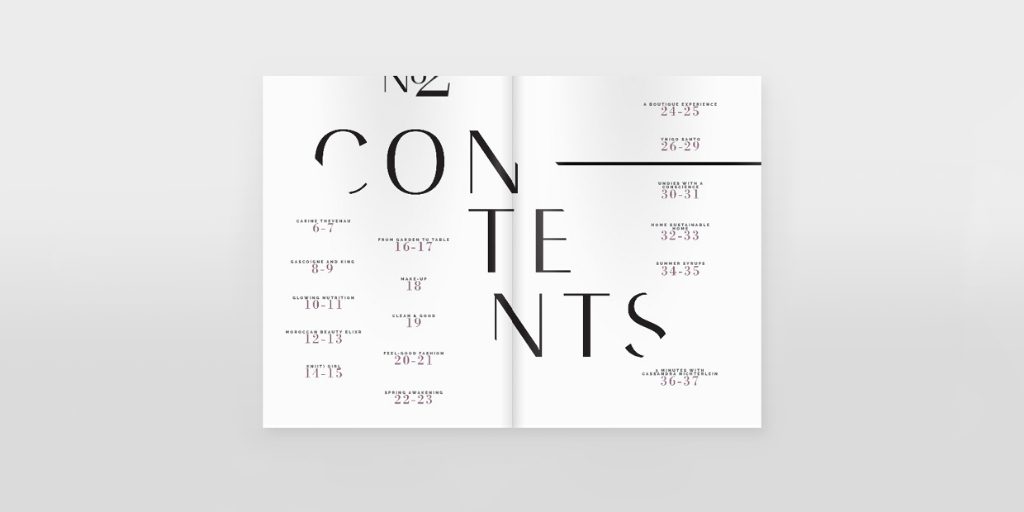
Use expressive typography that turns text into visual elements to show the many faces of text and to accentuate the purpose of the table of contents.
Make shapes with words
In terms of typesetting, make text into a shape that you like to add a character to your table of contents.
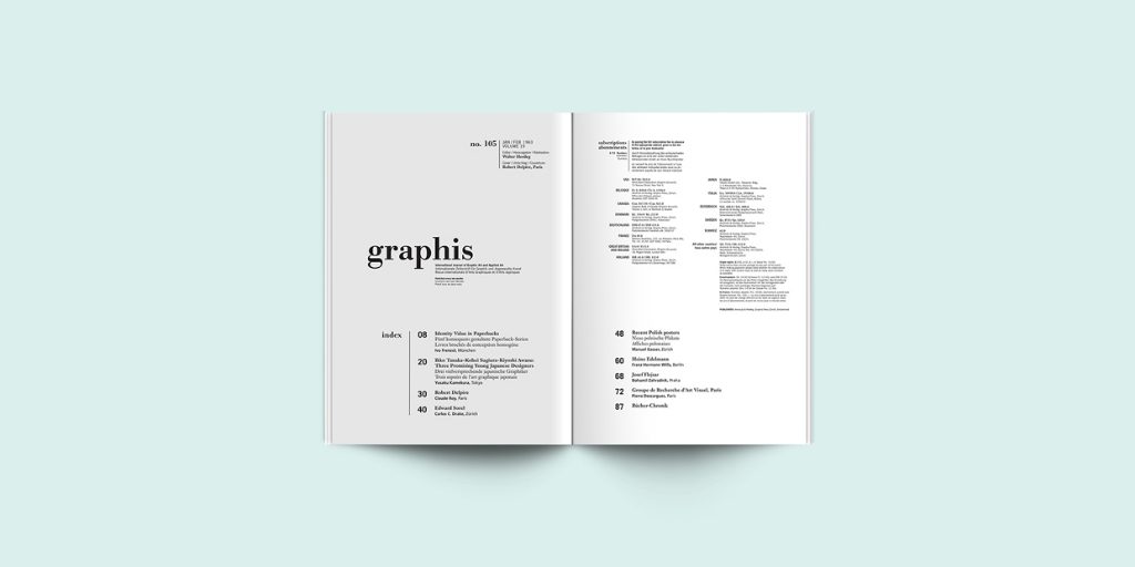
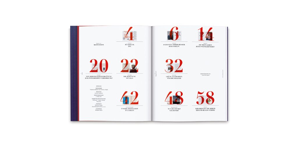
Numbers
Add brief descriptions & Create a hierarchy
Add a brief description for each chapter to help readers navigate. You can also build a hierarchy in the table of contents by giving the featured chapters visual emphasis so as to grab your readers’ attention.
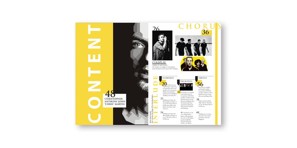
Go bold: Yellow and Large & Bold Numbers

Yellow represents happiness and energy. The bold combination of yellow and black creates an impactful presence for the enlarged numbers.
Turn number into design elements
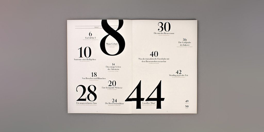
Turn numbers of different sizes into the key visual on your table of contents with the larger ones representing the cover stories or featured articles.
Overlaid layers
Try giving each section a subject spread image with bold page number overlaid. You can arrive at an appealing and distinctive table of contents layout.
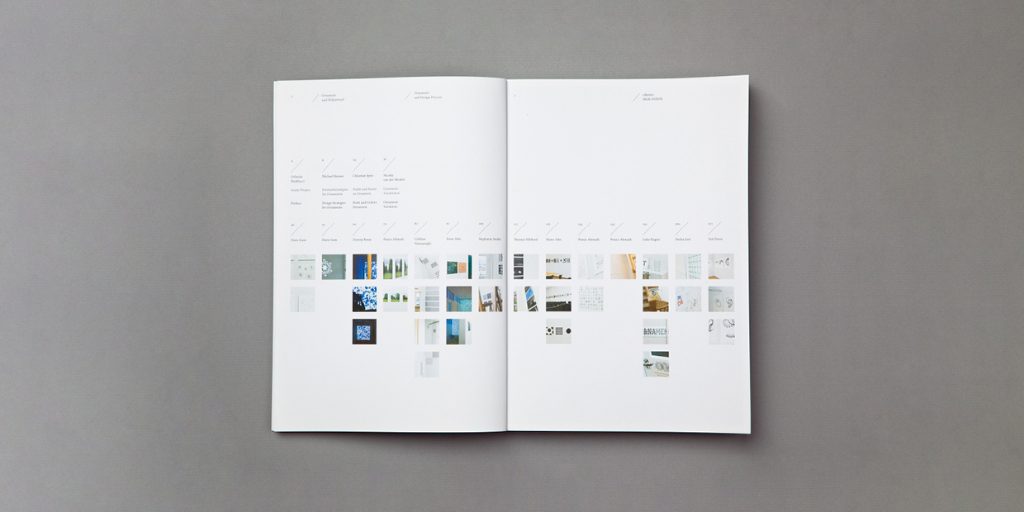
Put text box into grids

All clear at a glance, this is a neat and tidy layout without looking boring. The grids allow you to lay out the information clearly.
Poster-like
Stripe type with photographs
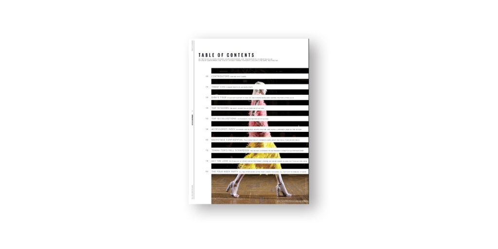
Like weaving, the alternate stripes of text and image gives a dramatic effect to the table of contents. However, be careful with the image that you choose, this could make the table of contents hard to read.
Representative image
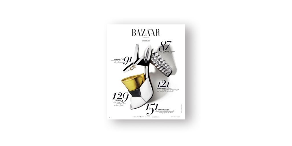
A common table of contents design in fashion magazines. A representative image surrounded by page numbers and chapter titles makes the layout interesting, while helps promoting the product in the image.
Infographic
Timeline
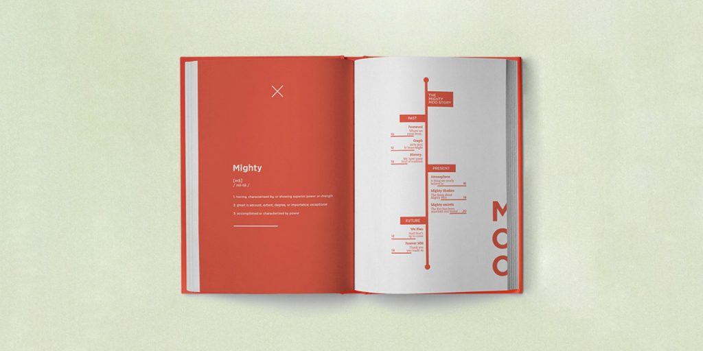
Insert design elements based on the actual content of your publication. Like Mighty Moo – The Story, a book about the brand’s history, it turns the table of contents into a timeline that tells the flow of the book.
Train map
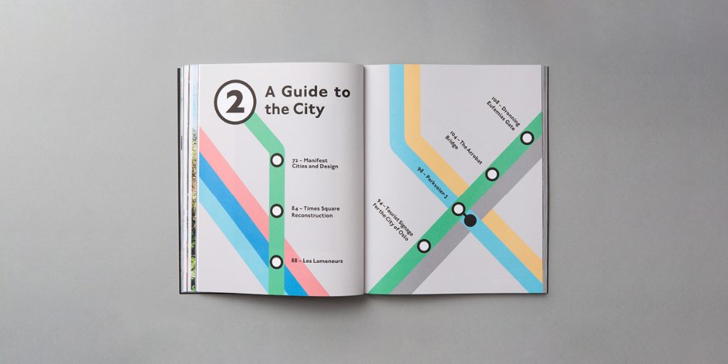
If you are making a tourist guide, why not make your table of contents like a train route map with chapter names and page numbers that is not difficult to use?
Give an icon & a colour to each chapter
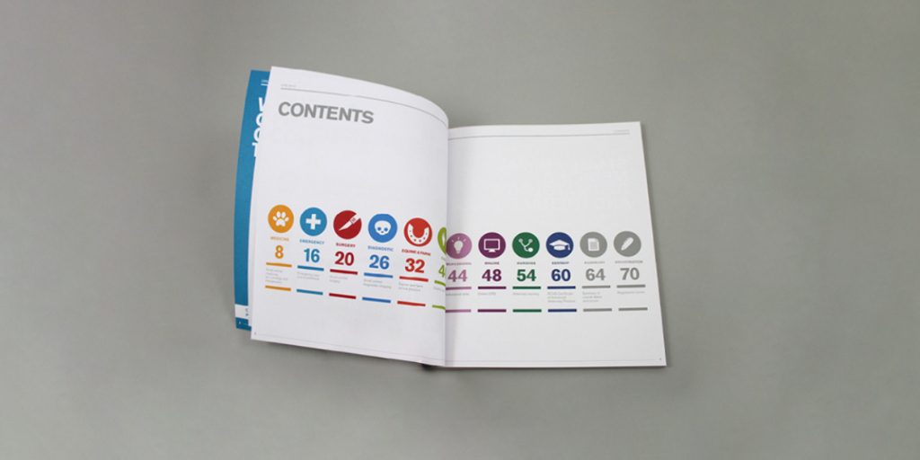
Put the chapters into categories by giving them a colour or an icon each that makes the publication easy to navigate.