Running an event is no easy task. From planning to execution, it requires a lot of efforts. One of the millions of tasks is to come up with a series of graphic elements for the event, including the brand identity, logo, print collateral, digital imagery, etc. A lot of design materials are involved in order to make an event work. The series of designs have to be consistent in the style, and aesthetics, tactile and unique to reflect the theme and vision of the event. Event graphic design is more or less like a branding task to leave a nice impression on the target demographic.
Whether it’s a trade show, a conference, a product launch event, a music show or other events, a key visual identity for the event will be first developed and then applied to the following design items to make the event more recognisable:
– Event Logo
– Event Invitation
– Event Signage/Backdrop/Banner
– Event Leaflet/Brochure/Booklet/Handout collateral
– Specialty / Promotional Items (Bookmarks, Gift Items, Thank You Notes, etc.)
– Web banners, EDM design
When we are commissioned to provide professional design services for an event, we first ensure we have a full understanding of the event’s theme and brief by talking to our clients. We never work in isolation as we believe stunning design is a product of communication. We then take into our clients’ budget, timings and creative style required to develop the design concept and collaterals. At every stage of the process, we work closely with our clients so that the visuals will be able to deliver the message and elevate the event profile.
Let’s see how we helped boost our clients’ brands through stunning event graphic design.
Case 1. Ear Up Music Global 2018/19
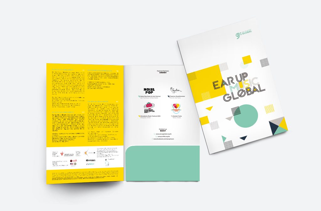
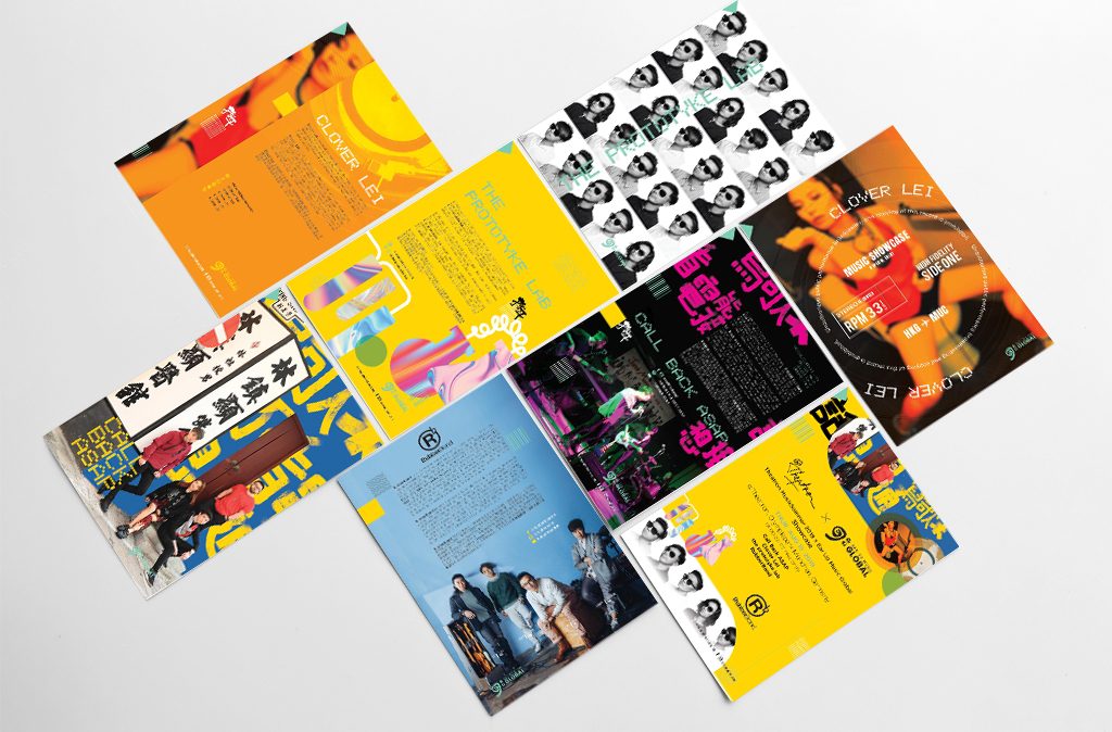
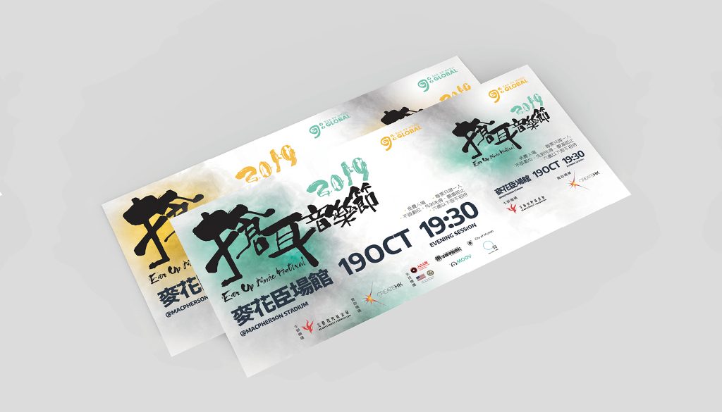
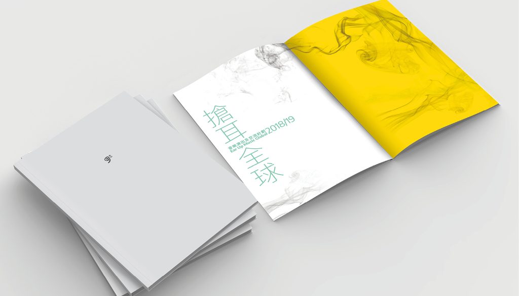
The Ear Up Music Global 2018/19 originated from the Ear Up Music Program in Hong Kong provides Hong Kong indie music talents with the opportunities to perform on a global music stage at four international music festivals in different countries. We were lucky enough to get involved in the design for this project. For the key visual, we picked mustard and mint green as the theme colours, and square, circle and triangle as the key visual elements. The mustard square represents the local Ear Up Music Program; the mint green circle stands for the Global Program; the triangles in four different colours represent four different countries; the shapes formed by different lines and dots represent “Communication”, “Music” and “Voice”. The geometric shapes form a dynamic pattern to reflect the nature of the music program. Each unit comes with a promotion leaflet to promote their music and philosophy. We were in charge of the photoshoot for each unit and the promotion leaflet design according to the unit’s image concept. The diversity in the design corresponds to the rich diversity in the music industry. We were also commissioned to design the invitation card, backdrop and booklet for the year-long international event.
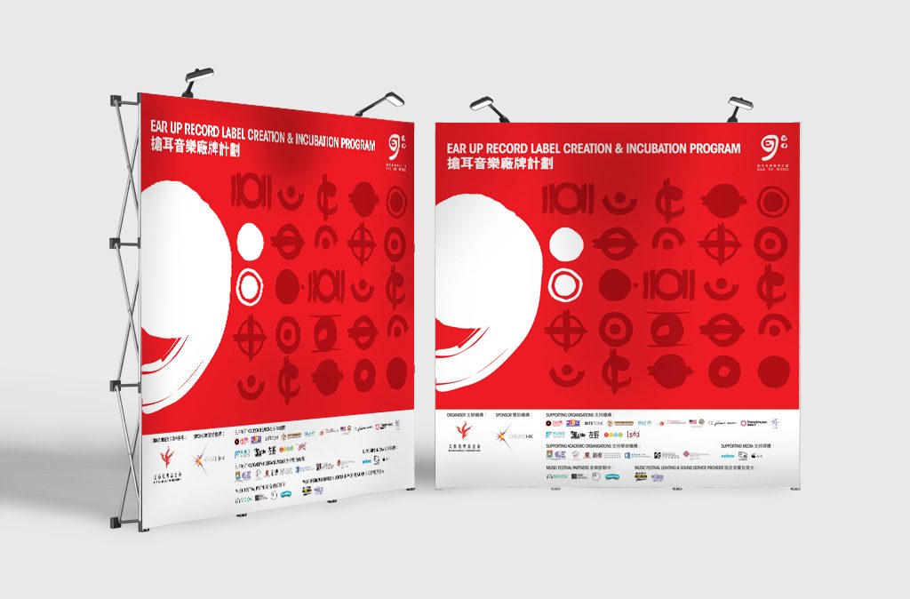
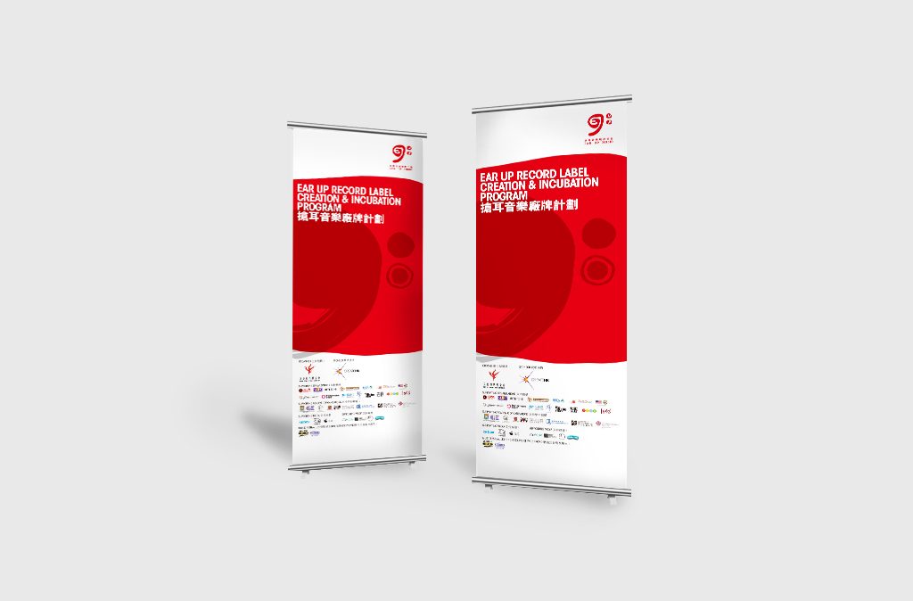
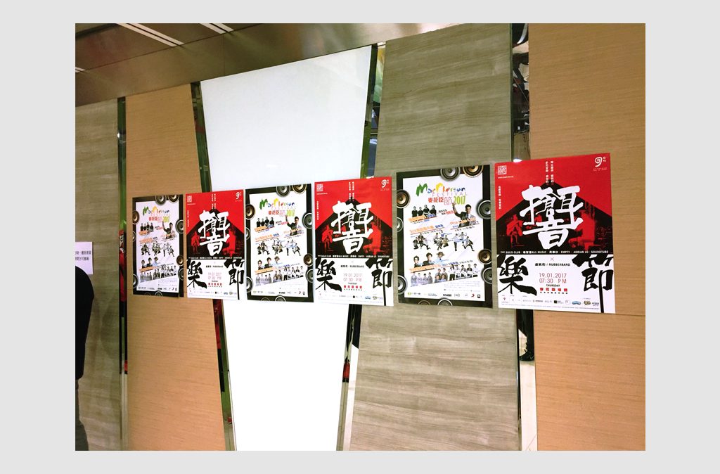
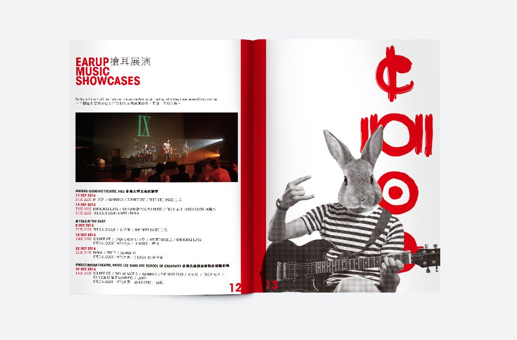
Case 2. Ear Up Music Record Label Creation and Incubation Program
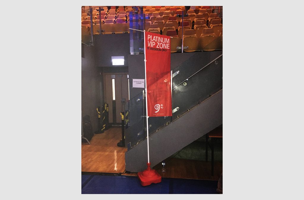
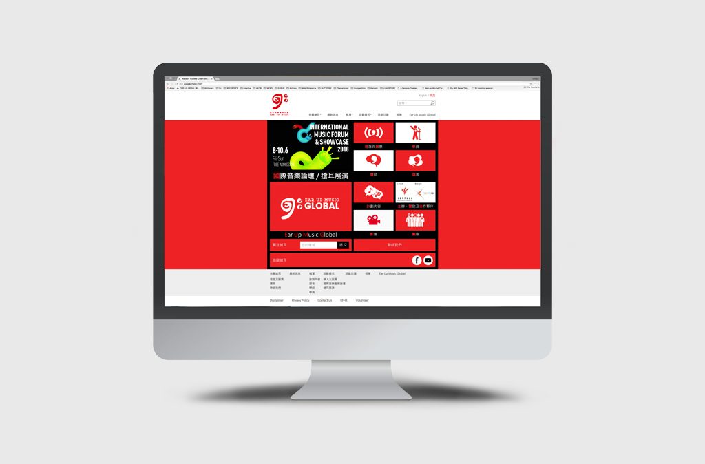
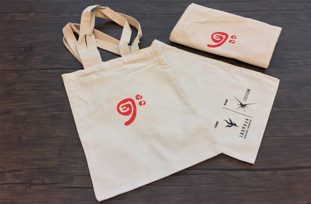
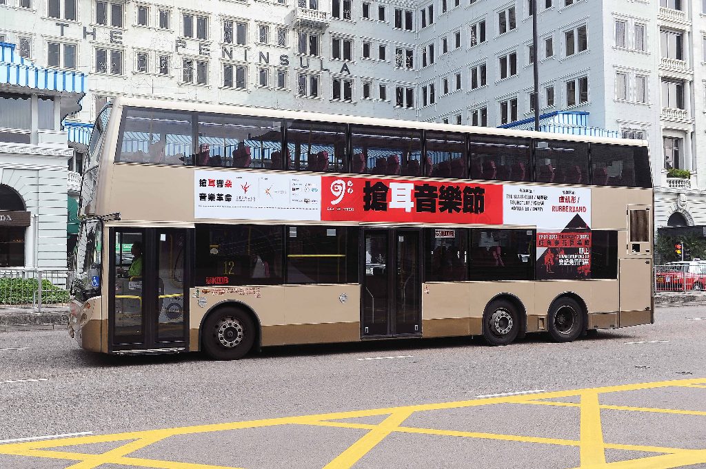
The Ear Up Record Label Creation and Incubation Program was launched by Renaissance Foundation to find and nurture local talent through the establishment of their own music brand and record label. The program covered an array of events including music showcase and music forums. We were commissioned to design the event graphics for the year-long event. Knowing that the program targeted at young music talents, we went for a bold and statement design in contrasting colours red and black to go in line with the talents’ adventurousness to make a change to music. The series of designs include a logo, poster, flyer, online banner, backdrop, website and more. Both online and offline materials successfully spread the event awareness and recognition.
Case 3. LIFE’S A BEACH: Renaissance Foundation Fund Raising Dinner
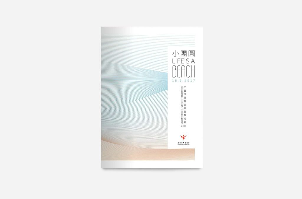
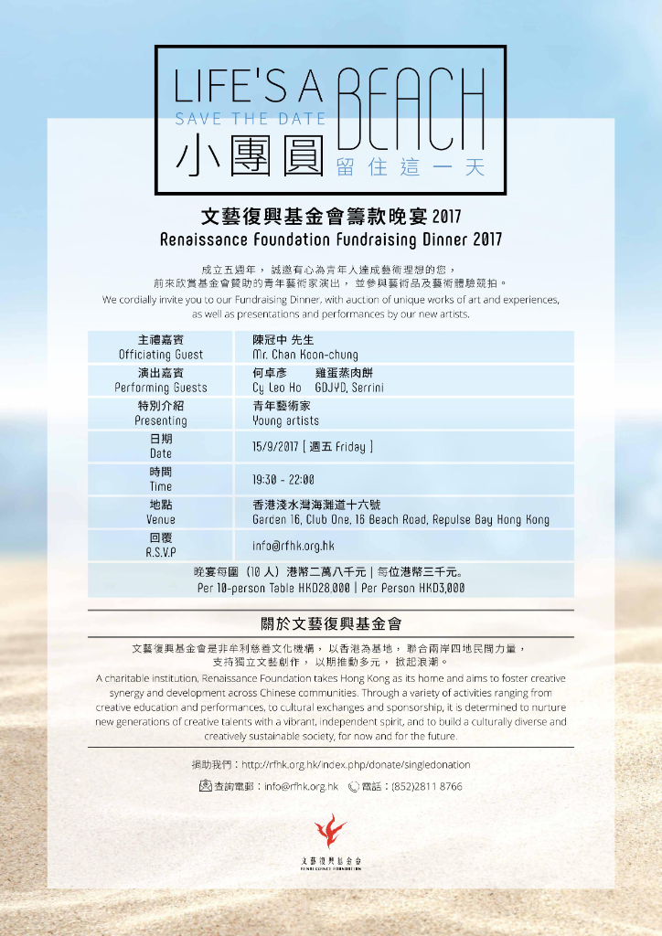
We also specialise in designing for small-scale events, including fund-raising dinners. Something as small as an invitation card or decorate the stage with a beautiful banner can draw the audience’s attention and set the event apart from others. The Renaissance Foundation Fund Raising Dinner was held to raise funds for nurturing upcoming generations of young creative talent. We were responsible for the design of the auction catalogue, background and invitation card. To correspond to the picturesque view of the event venue – Club One at the Repulse Bay, blue and light brown are picked as the primary colour of the theme to create a touch of calmness. The wave graphics on the pages are reminiscent of the soothing memories on beaches. Our design helped set the right, relaxed mood for the audience and stroke the right tone according to the objective of the event.
Auction booklet
Invitation
Case 4. MSD Zepatier Product Launch in Hong Kong
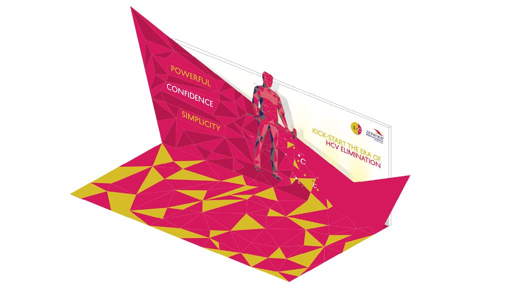
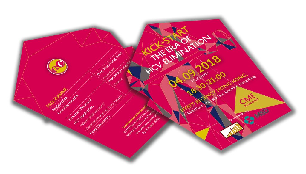
Product launch events are a smart marketing move to get people to know about a new product. It’s our job to provide this type of event with creative solutions that build a strong brand experience and impress the guests. The MSD Zepatier Product Launch targeted medical professionals, giving them a new option of medication for treating chronic hep-C in patients in Hong Kong. The goal of our design was to attract the professionals to opt for the medication in treatments. We were commissioned to come up with a key visual to represent the medication. After having a thorough research about the medication and how it was represented in other countries, we offered a new insight into the medication by using a hammer to represent how powerful the medication is. The design was modern, futuristic and eye-catching without going over the top to match the nature of the event. We had created a backdrop, an invitation card and souvenirs based on the key visual we came up. With our design and ideas, we had helped build the awareness and credibility for the new product as well as for the brand itself.
——————————————-
CC+ has helped our clients gain brand recognition through creating rich visual environments and collateral design. Drop us a line if you would love to see how we can do the same for you!
Tel: (850) 3460 5052
Email: info@ccplusmedia.com


 © 2018 CC+