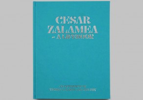
Awards
Hannahmama
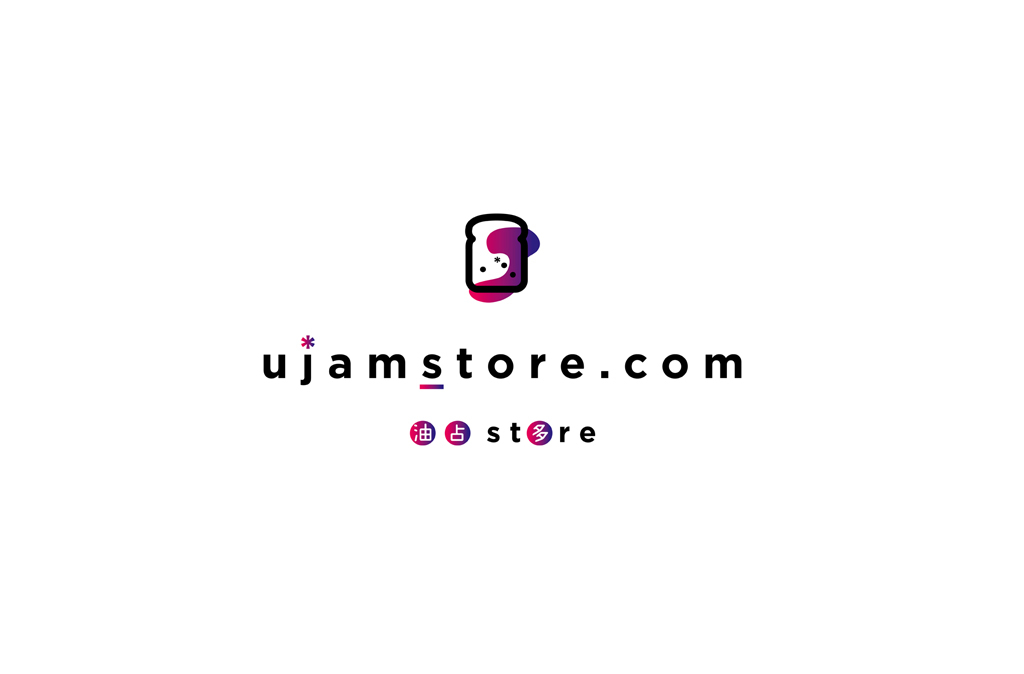
Prev. UJam Store Co. LTD.
-
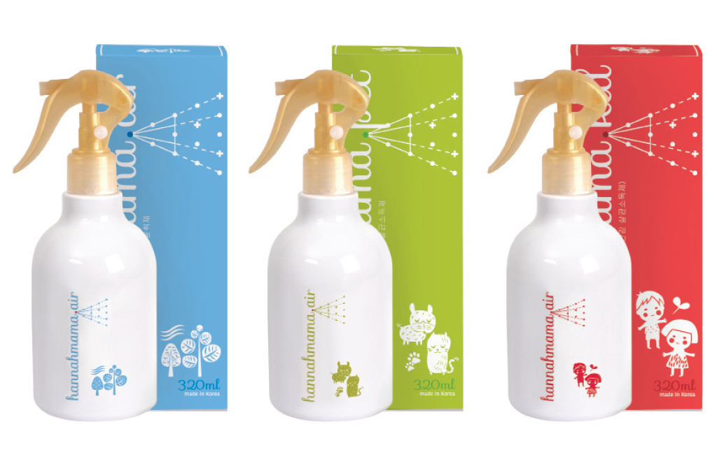
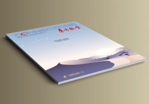
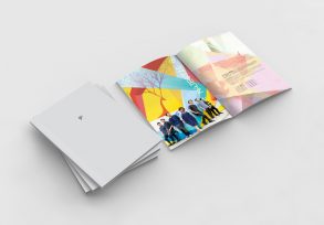
CC+ was responsible for the branding and package design for hannahmama. The brand name is formed by two words, ‘hannah’ and ‘mama’, all letters in lowercase script and in a neat calligraphy font, to achieve a feminine and friendly image: ‘hannah’ is a beautiful and feminine symmetrical name and ‘mama’ reflects the target customer of the brand. Each version has a different theme colour, and comes with different illustrations and a spray graphic to represent the product’s application area and features.
CC+為hannahmama進行品牌定位和包裝設計。品牌的主要銷售對像為女性,該品牌名稱由「hannah」和「mama」組成:「hannah」是一個對稱名字,充滿女性韻味;而品牌產品適合居家女性們使用,故加上「mama」一詞。整個標誌採用英文小寫和工整的書法字體,感覺溫婉淡雅。三個產品系列各採用一款顏色,並配上對應的插圖和噴霧圖案,表達其產品特色。


