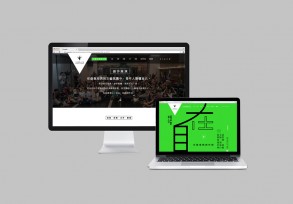
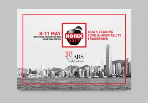
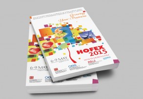
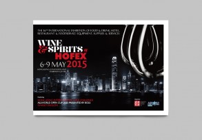
Awards
LUXE TRAVEL BOOK – LIMITED EDITION 1
-
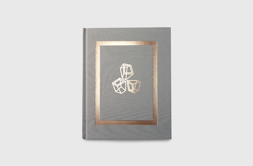
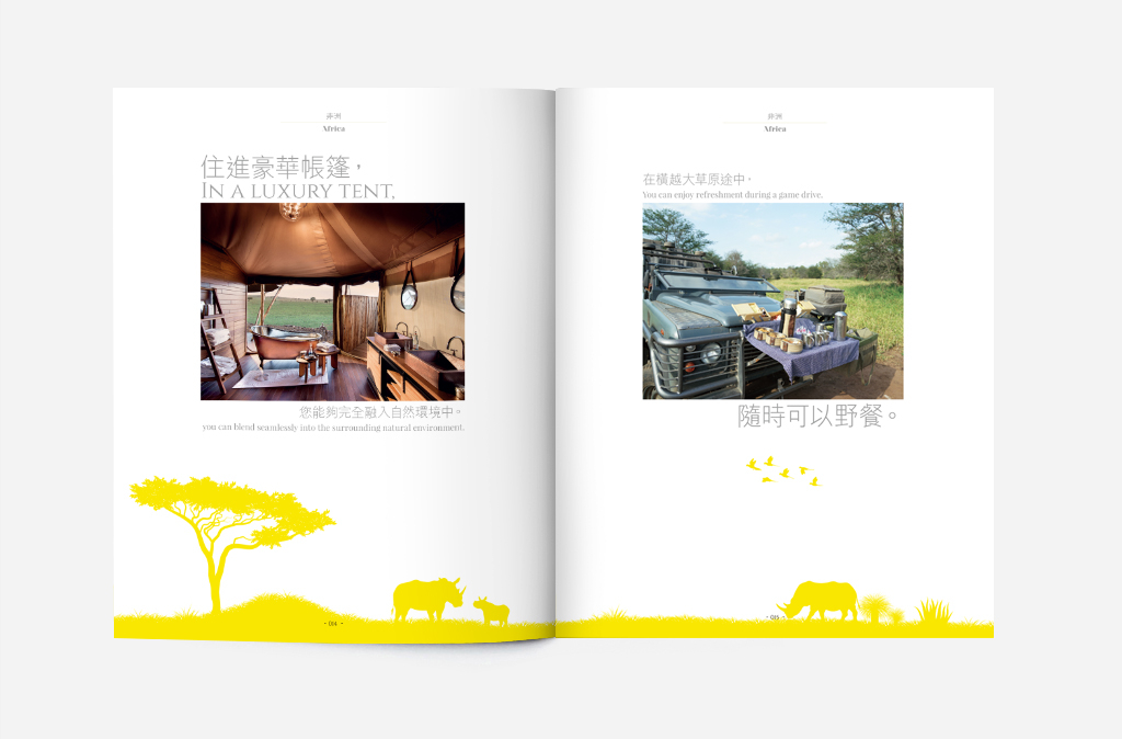
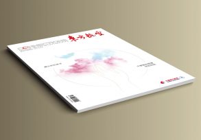
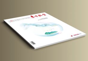
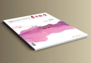
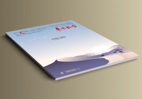
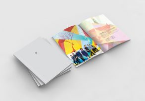
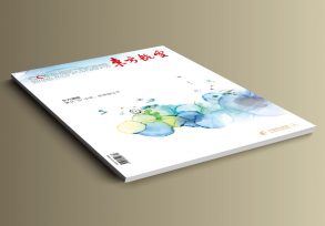
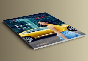
CC+ is glad to be the creative partner of Luxe Travel Limited for their ‘Luxe Travel Book – Limited Edition 1’. On the cover, the Chinese character ‘品’, the acronym for the Chinese name of Luxe Travel Limited, is represented by three foil-stamped 3D cubes, which symbolises Luxe Travel Limited’s exquisiteness and its mission to offer readers exceptional journeys with diverse perspectives. Canary yellow, the house colour of the company, is used throughout the whole book to a degree that mono yellow silhouette graphics and patterns dominate 50% of the layout. This helps build the brand of the company and enriches the reading experience.


